

Halloween 40% off every Pro plan. Lifetime from $51, pay once.40% off Pro Vanishes in Claim40% off
Classic Elementor widget · Free

Nav Menu for Elementor: A responsive header menu with dropdowns and a mobile panel

The Elementor Nav Menu widget is an Elementor menu widget for headers. It turns any WordPress menu into a menu bar with dropdowns and a hover pointer on desktop, and a hamburger button that opens a side panel on phones. Pick the menu, set the breakpoint, and style every state in the panel.

  • Free plugin
  • Multi-level dropdowns
  • 4 hover pointers
  • Hamburger and side panel

Classic widget · Elementor 3 and 4Updated

Live demos

Five header menus, live

Five ways to style an Elementor header menu, each on a small site. Hover or tap the items with an arrow, or use Tab and Enter. Each frame acts as a screen: on a phone, or in a narrow window, the menu turns into the hamburger.

Brand studio, Lyon

Brands that hold up on every screen

Strategy, identity and websites for teams who want to look like themselves.

Tablet showing a brand website made by the studio
Agency header

Outlined menu with a white dropdown

The header of a brand studio. Each top item sits in a thin rounded outline on a dark bar. The Services dropdown is a white card with rounded corners, and Brand Identity opens a third level to the side.

Hover Services, then Brand Identity

In Menu Settings, set Right Indicator to an angle right icon. In the Style tab, under Desktop Menu Item, set Border Radius to 15 px and Gap to 6 px. Under Desktop Submenu Item, set Wrapper Padding to 15 20 20 px.


Payments platform

Get paid in 40 currencies

Cards, wallets and bank transfers in one place, settled daily.

The Halden team reviewing payments on two large screens
SaaS header

Plain menu with a dark dropdown

The header of a payments product. The links have no outline, and a search icon and a Get started button sit at the right. The Product and Solutions dropdowns use the same near-black as the header.

Open Product, or tap the search icon

In the Style tab, under Desktop Submenu Item, set the Background to #121212 and Item Padding to 12 px. In Mobile Menu Settings, set Breakpoint to Tablet Portrait.

Fashion header

Header made of three dark pills

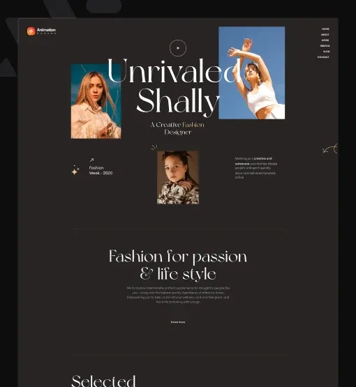
The header of a fashion label. The logo, the menu and the Book now button float as three dark pills on the page. On a phone the menu pill becomes a single hamburger button.

Hover Shop or Stores

Put the widget in a container with a dark background and a 25 px radius. Under Desktop Menu Item, set the Text Color to white. Under Desktop Submenu Item, set the Background to #121212.

Studio header

Uppercase pill menu, wide dropdown

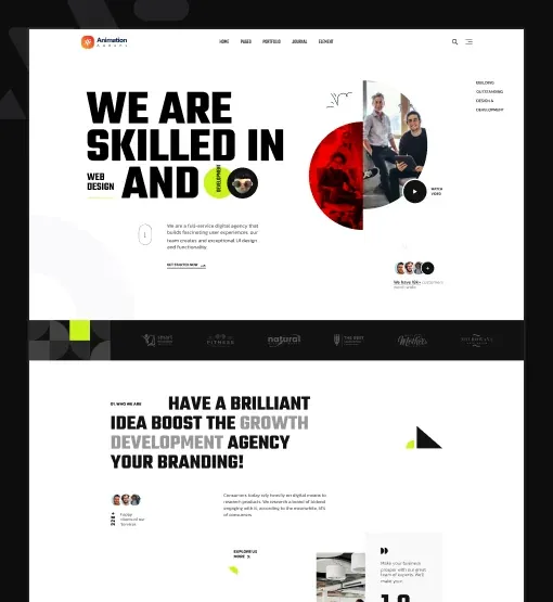
The header of a production company. Uppercase items sit in full pill outlines. The Services dropdown is a 310 px white panel, and each item gets a soft tint and a thin frame on hover.

Hover Services, then an item

Under Desktop Menu Item, set Border Radius to 30 px. Under Desktop Submenu Item, set Width to 310 px and Item Border Radius to 7 px. In Mobile Menu Settings, set Breakpoint to Tablet Landscape.

Interior studio

Rooms that feel lived in

Calm homes in natural materials, drawn and furnished by one small studio.

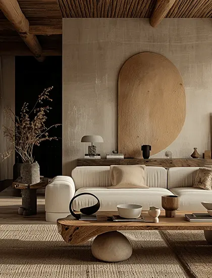
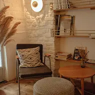
Living room with a round wall panel and low sofaReading corner with a chair and wooden shelves
Interior studio header

Line header with boxed logo and button

The header of an interior studio. A line runs under the bar, the logo and the Enquire button sit in bordered boxes, and the menu is centred between them. The Shop dropdown is the plain white default with a soft shadow.

Hover Shop, then the button

In Menu Settings, set Menu Alignment to Center. Under Desktop Menu Item, set the Text Color to #FCF9F4. Under Mobile Menu Back, set the Color to #A09F9F.

Features

Key features of Nav Menu

What the widget gives you, each tied to a setting in the Elementor panel.

Any WordPress menu

Pick a menu you manage under Appearance → Menus in Select menu. Edit the menu links in WordPress and the header updates.

Horizontal or vertical

Set the Layout to horizontal for a top bar, or to vertical for an Elementor vertical menu in a sidebar. Menu Alignment sets start, center, end or space between per device.

Elementor dropdown menu

Sub-menus fade in below their item, and deeper levels open to the side, so a multi-level menu works out of the box. Choose the icons in Down Indicator and Right Indicator.

Elementor menu hover effect

Pick a Hover Pointer: dot, underline, overline or line through, with its own width, height and colour.

Responsive Elementor mobile menu

Choose the Breakpoint where the hamburger takes over: a device size, all devices, or none.

Hamburger menu side panel

The panel opens on the left or right (Position, Width); sub-menus slide in with a Mobile Menu Back link.

Normal, hover and active

Set text colour, background and border colour for each state in Desktop Menu Item and Desktop Submenu Item.

Style every part

Typography, gap, padding, borders and radius for menu items, the submenu wrapper (with its own Width), the Submenu Indicator, the Mobile Menu, the Hamburger and the Mobile Menu Close button, so the website navigation matches your header design.

Step by step

How to add a menu in Elementor

Five steps. The bold names are the labels in the Elementor panel.

  1. Create your menu in WordPress under Appearance → Menus, with sub-items for the dropdowns.

  2. Install the free Animation Addons plugin, turn on Nav Menu in Animation Addons → Elements, and drag the widget into your header.

  3. In Menu Settings, choose the menu in Select menu, then set Layout, Menu Alignment and Hover Pointer.

  4. In Mobile Menu Settings, choose the Hamburger Icon, the Mobile Icon that closes the panel, and the Breakpoint where the hamburger appears.

  5. Style the items, dropdowns, Mobile Menu and Hamburger in the Style tab, then check each device in responsive mode.

Try it free Free on WordPress.org · Works with Elementor Free
FAQ

Questions about Nav Menu

How do I add a menu in Elementor?

Create the menu under Appearance → Menus, drag the Nav Menu widget into your header, and pick the menu in Select menu. Then set the layout, alignment and mobile breakpoint.

Is this a free Elementor menu widget?

Yes. Nav Menu is part of the free Animation Addons plugin on WordPress.org, and it works with Elementor Free. You do not need Elementor Pro.

Can I make an Elementor vertical menu?

Yes. Set Layout to Vertical and the menu items stack in a column, which suits a sidebar or a side header. Horizontal is the default.

Does it make an Elementor multi level menu?

Yes. Sub-menus open below their item, and deeper levels open to the side. On mobile, each level slides in with its own Back link.

Can Nav Menu build an Elementor mega menu?

Not today. Nav Menu shows standard WordPress dropdowns, not multi-column mega menus. Mega Menu is a separate Pro item that the plugin lists as coming soon. In Elementor 4, the Pro Nav element can hold mega-menu-style panels.

How does the Elementor hamburger menu work?

Below the breakpoint, the menu becomes a hamburger button. It opens a side panel with your links; items with sub-menus slide their links in, with a Back link to return.

Can I choose when the hamburger appears?

Yes. Set the Breakpoint in Mobile Menu Settings to a device size, to All for a hamburger on every screen, or to None to always show the full menu bar.

Which hover effects does the menu have?

The Hover Pointer adds a dot, an underline, an overline or a line through on hover, and you can set its width, height and colour. You can also change text, background and border colours on hover.

Can I style the Elementor dropdown menu?

Yes. Desktop Submenu Item sets the dropdown width, background, border, padding, radius and the item colours for Normal, Hover and Active.

Does it work in Elementor 4?

Yes. It is a classic widget, so Elementor 4 lists it with the legacy widgets. For the new Atomic Editor there is also the free WP Menu element.

Animation Addons Pro · Elementor 4

Menus that work on every screen

A free header menu with dropdowns, hover pointers and a mobile panel, built and styled in Elementor.

Halloween deal40% off every Pro planEnds 5 Nov

  • 15-day money-back guarantee
  • Rated 4.6 / 5 on WordPress.org
  • No Elementor Pro needed
  • Elementor 3 & 4 in one license