Halloween 40% off every Pro plan. Lifetime from $51, pay once.40% off Pro Vanishes in Claim40% off
Classic Elementor widget · Free

Advanced Button for Elementor: An animated Elementor button with eight hover effects

The Elementor button widget with the hover effect built in. Pick one of eight styles: a 3D text flip, a fill that starts where the pointer enters, icons that slide in, a sliding fill or an outline ring. Set your text, icon and link, then match your colours. Free, on Elementor Free.

  • Free on WordPress.org
  • 8 hover effects
  • Icon before or after
  • Gradient backgrounds

Classic widget · Elementor 3 and 4Updated

Live demos

All eight button styles, live

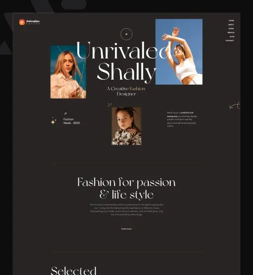
Eight Elementor button hover effect examples, one per style, on small sites for a fashion label, an interior studio, an agency and a film studio. Hover a button, or tab to it with the keyboard.

ShallyNew inLookbookJournal
Autumn 26

Soft tailoring for colder days

Twelve looks in wool, linen and washed cotton, made in small runs in Porto.

A model in a long camel coat for the Shally autumn lookbook
Fashion lookbook

Lookbook links with an arrow

Two text links under a lookbook intro. On hover the arrow slips out to the top right and a new one slides in from the bottom left.

Hover a link

Set Style to 1, Text to View lookbook and Border Width to 1 px. The second link only has its own Color.

Maison FormeProjectsServicesContact
Interior design

A calm home, planned room by room

A two-hour visit, a written brief and a first mood board within ten days.

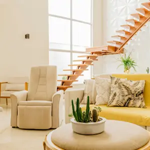
A bright living room designed by Maison Forme
Booking page

Booking buttons with a hard shadow

Two outlined buttons on a studio services page. On hover a solid shadow appears at the bottom right, so the button looks lifted.

Hover the buttons

Set Style to 2, add a solid Border Type, and under Hover add a Box Shadow with no blur and a 7 px offset.

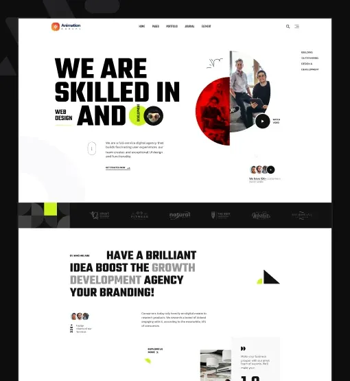
Arolax®WorkServicesStudio
What we do

Brands, sites and launch campaigns

Strategy, identity and Elementor builds for teams that want to move fast and look sharp.

Arolax designers reviewing printed brand layouts
Agency services

Service buttons that flip their text

Two buttons in a services section. On hover the text flips over in 3D and the same words roll in from below, like a split-flap sign.

Hover the buttons

Set Style to 3, Border Radius to 0 30 0 30, and pick a Color for the Normal and Hover states.

Arolax®WorkStudioContact
New business

Have a project in mind?

Tell us what you are building. We reply within one working day.

Contact call to action

Round contact buttons

Two round buttons on a contact band. A colour fill grows from the exact point where the pointer enters, and an arrowhead shows on the line.

Hover from different sides

Set Style to 4. The arrow comes with this style, so Icon is hidden. Choose the fill under Hover, in Background Type.

Arolax®WorkStudioContact
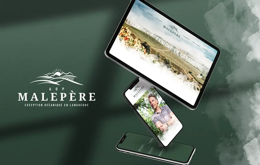
Rows of vines at sunset for the Malepère wine case study
Case study · Wine

Malepère: a 300-year-old estate, online

A new identity and an online shop that tripled direct sales in one season.

Case study

Case study buttons with round icons

Two pill buttons under a wine case study. On hover the right icon shrinks away and a new icon grows in on the left.

Hover the buttons

Set Style to 5, Icon Width to 54 px and Border Radius to 30 px.

ShallyWomenMenJournal
Two models in linen shirts for the Shally summer collection
The linen edit

Light layers for long evenings

Shirts, trousers and dresses in washed European linen.

Shop categories

Shop links with round icons

Two pill buttons on a linen collection banner. On hover the left icon slides away and the icon on the right grows in.

Hover the buttons

Set Style to 6, Icon Width to 54 px and Gap to 0.

NorthlightFilmsFestivalAbout
A still from the Northlight short film, a figure in evening light
Now showing

The Long Light, a short film

Twenty-two minutes on the last ferry of the season. Premieres on 6 November.

Film launch

Trailer and ticket buttons in a ring

A filled pill inside an outline ring on a film page. On hover the fill pulls up out of sight and leaves the outline and a thin bar on top.

Hover the buttons

Set Style to 7 and Outline Gap to 6 px. Use a light grey Border Type for the ring.

Maison FormeProjectsJournalContact
The Maison Forme studio with sample boards on the wall
Contact

Let’s plan your space

The studio is open Monday to Friday, 9 to 6, at 14 Rue des Arts.

Contact page

Contact buttons with a sliding fill

Two outlined pills on a studio contact page. On hover a colour fill slides in from the right with a small bounce.

Hover the buttons

Set Style to 8, Border Radius to 35 px and the hover Color to white.

Features

Key benefits of the Advanced Button

Every item below is a real setting in the widget panel. No CSS, no custom code.

8 pre-built button styles

Pick a Style from 1 to 8 and the hover animation is ready: icon swap, offset shadow, 3D flip, pointer fill, sliding icons, outline ring or sliding fill. These are the Elementor button styles of this widget.

Custom text and icon

Write your own Text, choose an Icon from the Elementor library or your own SVG, and set its size and gap. That makes an Elementor button with icon.

Icon before or after

Use Icon Position to put the icon after or before the text, for back links, downloads and next steps.

Link options

The Link field opens in a new tab, adds nofollow or custom attributes, and links to any page, anchor, email or phone number. Elementor button open in new tab is one click.

Gradient and colour backgrounds

Set a solid colour or a gradient Background Type for both the normal and the hover state. That gives you an Elementor button gradient background with its own hover colour.

Outline gap

Style 7 adds an Outline Gap between the fill and the outer ring, for a refined double-border look.

Hover shadow

Style 2 adds a Box Shadow on hover, the hard offset shadow of the Elementor button hover effect in the first row of demos.

Fully customizable

Typography, border, border radius, padding, icon width and alignment, each responsive, so the button fits your design on every screen. Set the Elementor button hover color for the text and the border as well.

Step by step

How to add an animated button in Elementor

Five steps, no code. The bold names are the labels in the Elementor panel.

  1. Install and activate Animation Addons for Elementor from WordPress.org.

  2. Open your page in Elementor, search the panel for Advanced Button and drag it onto the page. That is how to add a button in Elementor with hover animation.

  3. Choose a Style from 1 to 8, then write the Text and pick an Icon and Icon Position.

  4. Add the Link, and set it to open in a new tab or add nofollow if you need to.

  5. In the Style tab, set the colours and background for Normal and Hover, check it on mobile and publish.

Try it free Free on WordPress.org · Works with Elementor Free
FAQ

Questions about the Advanced Button

How do I add a hover effect to an Elementor button?

Without any code: drag the free Advanced Button from Animation Addons onto your page and choose a Style from 1 to 8. Each style has its hover animation built in, so you only set the text, icon, link and colours. No CSS is needed.

What hover effects does the Advanced Button have?

Style 1 swaps the icon diagonally, style 2 adds an offset shadow, style 3 is an Elementor 3d flip text button that turns the text in 3D, style 4 grows a fill from the pointer, styles 5 and 6 slide round icons in and out, style 7 lifts the fill out of an outline ring, and style 8 slides a colour fill across. Together they are eight Elementor button styles.

How do I make an animated button in Elementor?

Use the Advanced Button. Pick a style, and the Elementor button animation runs on hover with no keyframes or CSS to write. For other motion, the Pro Animation tab can add an entrance effect to the same button.

Can I put an icon in the button, before the text?

Yes. Pick the Icon, then set Icon Position to Before. Styles 5 and 6 always show round icons on both sides, and style 4 uses a drawn line with an arrowhead instead of an icon.

Can I use a gradient button background?

Yes. The Background Type control in the Style tab takes a solid colour or a gradient, and you can set a different one for the hover state, so you can make an Elementor button with a gradient background.

Can the button open in a new tab or use nofollow?

Yes. The Link field has Open in new window, Add nofollow and Custom Attributes, the same options as other Elementor links.

How do I change the button color on hover?

In the Style tab, set Color and Border Color under Normal, then set them again under Hover. The Elementor button hover color changes the text, the fill and the border.

Is the Advanced Button free, and do I need Elementor Pro?

It is a free Elementor button addon in the Animation Addons plugin on WordPress.org, and it works with Elementor Free. Elementor Pro is optional.

Does it work in Elementor 4?

Yes. It is a classic widget, so Elementor 4 lists it with the legacy widgets and it works on the same page as atomic elements.

What happens on phones, where there is no hover?

The button shows its normal design and works as a normal link on the first tap. The hover effect is extra polish for mouse and keyboard users, so nothing important is hidden behind it.

Animation Addons Pro · Elementor 4

Buttons people want to click

Eight animated hover effects for your calls to action, free on Elementor Free.

Halloween deal40% off every Pro planEnds 5 Nov

  • 15-day money-back guarantee
  • Rated 4.6 / 5 on WordPress.org
  • No Elementor Pro needed
  • Elementor 3 & 4 in one license