 Login
Login

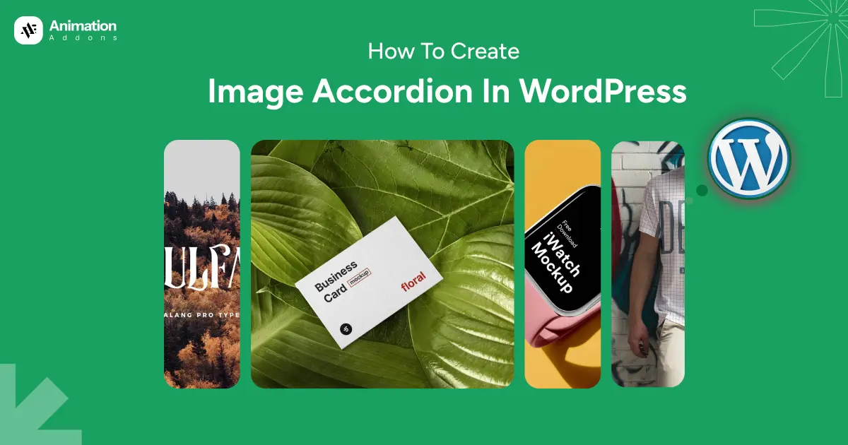
If you have ever wanted your Elementor website to feel more interactive and visually engaging, an image accordion is one of the simplest and most effective ways to get there. Instead of displaying images in a plain grid, an image accordion lets users hover over panels to expand images with titles, descriptions, and buttons. The result feels dynamic, modern, and far more engaging than a static layout.
The good news is that you do not need to write a single line of code to build one. With the Image Accordion widget from Animation Addons for Elementor, you can create a fully interactive, customizable accordion section right inside the Elementor editor.
In this blog, you will learn exactly how to set up the Image Accordion widget, configure each panel, and style the final output to match your brand. Whether you are a beginner just getting started or a freelancer building client websites, this guide walks you through every step clearly.
What is an Image Accordion?
An image accordion is a row of stacked or side-by-side image panels that expand when a user hovers over or clicks on them. Each panel typically contains a background image, a title, an optional subtitle, a short description, and sometimes a button or link.
This layout is popular on portfolio sites, agency homepages, team pages, services sections, and digital marketing landing pages because it packs a lot of visual content into a small, elegant space.
Beyond looking impressive, an image accordion also serves a practical purpose. It organizes related information into a compact space without sacrificing detail. A visitor can read a short description for each panel without the page feeling cluttered.
What You Will Need
Before you begin, make sure you have the following in place:
- WordPress installed on your website
- Elementor (free version works)
- Animation Addons for Elementor plugin installed and activated
- A page created in Elementor where you want to add the accordion
If you have not installed Animation Addons yet, you can download it free from WordPress.org. Once installed, activate it from your WordPress dashboard.
Step-by-Step: How to Create an Image Accordion in Elementor
Follow this simple step-by-step guide to easily create a visually engaging Image Accordion in Elementor and enhance your website’s design with interactive image sections.
Step 1: Activate the Image Accordion Widget
Before you can use the Image Accordion widget, you need to make sure it is enabled in your Animation Addons settings.
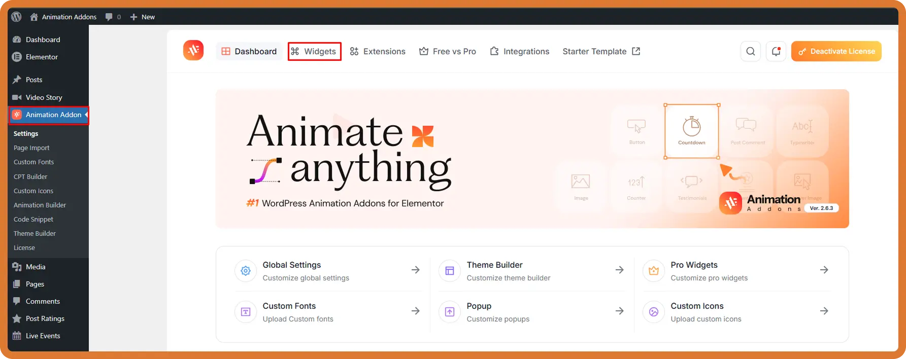
To enable the Image Accordion widget, first go to your WordPress Dashboard, then locate and click on Animation Addons in the left-hand sidebar to access its settings. From there, navigate to the Widgets tab, where you’ll find a list of available widgets.
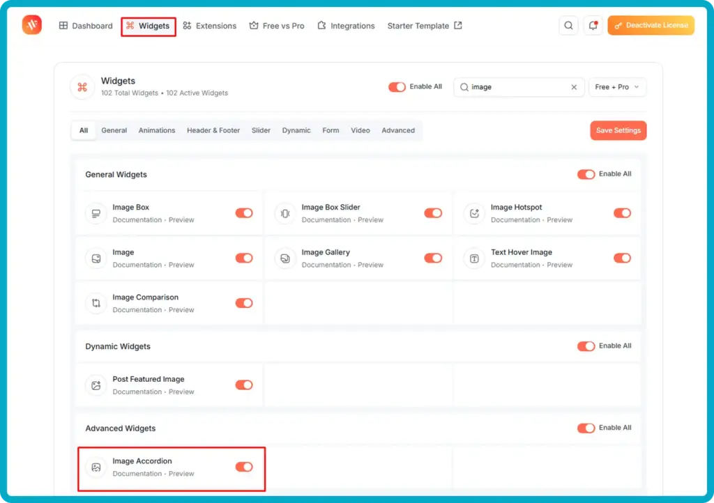
Use the search bar at the top and type “image” to quickly filter the results. Once the filtered list appears, scroll down to the Advanced Widgets section and find the Image Accordion widget. After locating it, simply toggle the switch next to it to enable the widget, and finally, click on the Save Settings button to apply and store your changes successfully.
Once saved, the Image Accordion widget will be available inside the Elementor editor. You only need to do this activation step once.
Step 2: Open Your Page in Elementor
Next, navigate to the page where you want to add your image accordion.
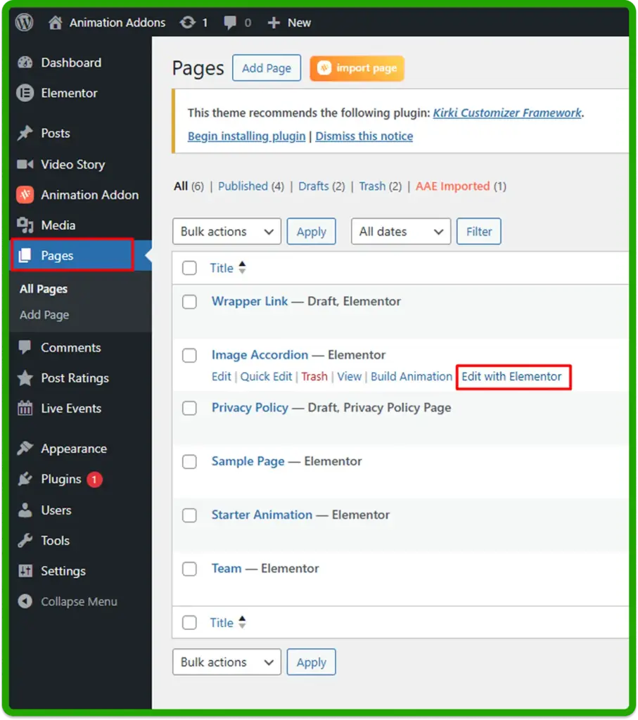
To begin editing your content, first go to the Pages section in your WordPress dashboard, where you’ll see a list of all existing pages on your website. From there, locate the specific page you want to modify and click on the Edit with Elementor option to launch it inside the Elementor editor.
If you’re creating a new page instead, click on the Add New Page button, give your page a title, and then select Edit with Elementor to open a blank canvas where you can start building your page from scratch. Once you are inside the Elementor editor, you are ready to add the widget.
Step 3: Add the Image Accordion Widget
With the Elementor editor open, search for the Image Accordion widget in the widget panel.
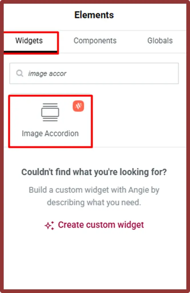
To add the Image Accordion widget to your page, start by clicking the “+” icon within the Elementor editor to create a new section, or simply select an existing section. Next, go to the widget panel on the left-hand side and use the search bar to type “Image Accordion,” which will quickly locate the widget for you. Once it appears in the results, click and drag the Image Accordion widget from the panel and then release it so you can begin customizing its content and design.
You will immediately see a default accordion layout appear with placeholder items. From here, you can customize everything in the left panel.
Step 4: Add and Configure Your Accordion Items
This is where the real customization begins. Each accordion item represents one image panel in the finished layout.
Configure Item 1
Click on Item 1 in the left panel to expand its settings.
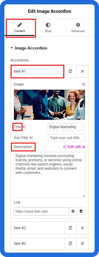
- Image: Click the image thumbnail to upload or select an image from your media library. Choose a high-quality image that works well as a wide panel background.
- Title: Enter a short, descriptive title for this panel. For example, “Digital Marketing” or “Web Design.”
- Sub Title: Add an optional subtitle below the main title if needed.
- Description: Write a short paragraph describing what this panel is about. Keep it concise — two to three sentences works well.
- Link: Add a URL if you want this panel to be clickable and take the user to another page.
Add More Items
To add additional panels, scroll down in the content panel and click “+ Add Item”. Repeat the same process for each item, adding a unique image, title, and description for every panel.
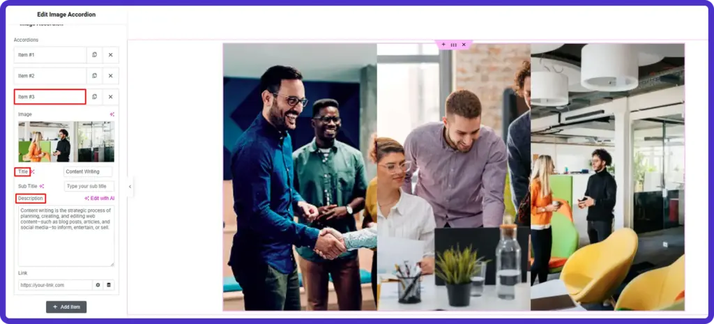
Most accordion layouts work best with three to five items. Too few panels reduce the visual impact, while too many can feel overwhelming on smaller screens.
Step 5: Configure the Button Settings
The Image Accordion widget includes a built-in button for each panel, which you can use to drive clicks toward a specific page or action.
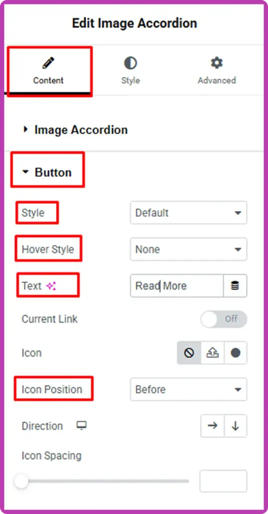
- In the Content tab, scroll down to the Button section.
- Set the Style to your preferred button type (Default is a good starting point).
- Under Text, change the label from “Read More” to something more relevant, such as “Learn More,” “View Project,” or “Get Started.”
- Set the Hover Style if you want a different appearance when the user hovers over the button.
- Choose an Icon from the icon library if you want to add a small visual indicator to the button.
- Use Icon Position to place the icon before or after the button label.
- Adjust the Direction arrow to control whether the button flows horizontally or vertically.
These small details make a big difference in how polished and clickable your accordion looks.
Step 6: Style the Accordion Content
Switch to the Style tab in the left panel to control how text, colors, and layout appear on each panel.
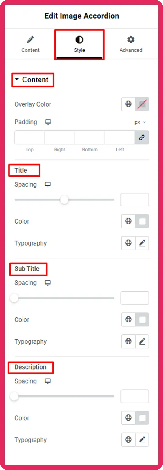
Overlay Color
Use the Overlay Color option to add a semi-transparent color layer over each image. This improves text readability, especially when your images are bright or busy. A dark overlay at around 40 to 60 percent opacity usually works well.
Padding
Adjust the Padding values to control the spacing inside each panel around the title, subtitle, and description text.
Title Styling
Under the Title section:
- Use Spacing to control how far the title sits from the top of the panel content.
- Set the Color to white or any color that contrasts well with your image.
- Choose a Typography style to match your website’s font system.
Sub Title Styling
The subtitle follows the same controls: Spacing, Color, and Typography. Keep the subtitle slightly smaller than the title for a clear visual hierarchy.
Description Styling
Use the Description section to set the font color and size for the body text. Gray or light white tends to read well over dark overlays. Keep the font size between 14px and 16px for comfortable readability.
Step 7: Preview and Publish
Once you are satisfied with the layout and styling, click Preview to see how the accordion looks on the front end. Hover over each panel to confirm the expand effect is working correctly.
If everything looks good, click Publish to make the page live.
Best Practices for a Great Image Accordion
Following a few simple design principles will make your image accordion look more polished, user-friendly, and effective at capturing attention.
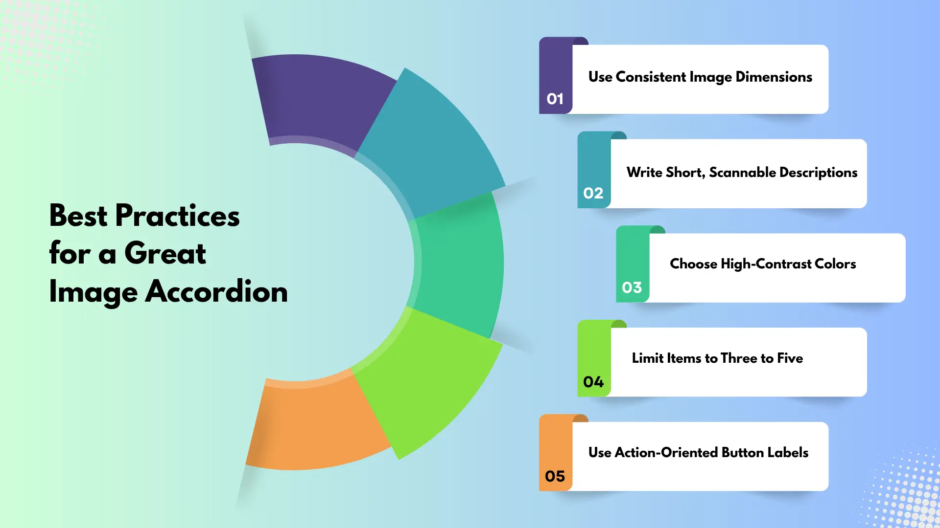
Use Consistent Image Dimensions
Always use images with the same aspect ratio and similar dimensions to keep your accordion visually balanced. When images vary in size, the panels can look uneven and disrupt the overall layout. Consistency ensures smooth transitions when panels expand and collapse, creating a more professional and cohesive design.
Write Short, Scannable Descriptions
Users typically interact with accordions quickly, so your text should be easy to scan at a glance. Keep descriptions concise—ideally within two to three short sentences—and focus only on the most important information. Break up longer ideas into simple phrases so visitors can instantly understand the content without feeling overwhelmed.
Choose High-Contrast Colors
Make sure your text stands out clearly against the image background. Low contrast can make titles and descriptions difficult to read, especially on smaller screens. Adding a dark or semi-transparent overlay on top of images helps improve readability while maintaining the visual appeal of your design.
Limit Items to Three to Five
Using too many accordion items can reduce the impact of the interactive effect and make the layout feel cluttered. Keeping the number of panels between three and five allows each item to stand out and gives users enough space to explore without distraction. This also improves usability on tablets and mobile devices.
Use Action-Oriented Button Labels
Replace generic button text like “Read More” with clear, action-driven labels that tell users exactly what to expect. Phrases such as “Explore Services,” “View Portfolio,” or “Learn More About Us” provide better direction and encourage clicks. Strong, descriptive labels improve both user experience and conversion rates.
Common Mistakes to Avoid
Even experienced designers can overlook small details that impact both design quality and usability. Here are some common mistakes to watch out for and how to avoid them.
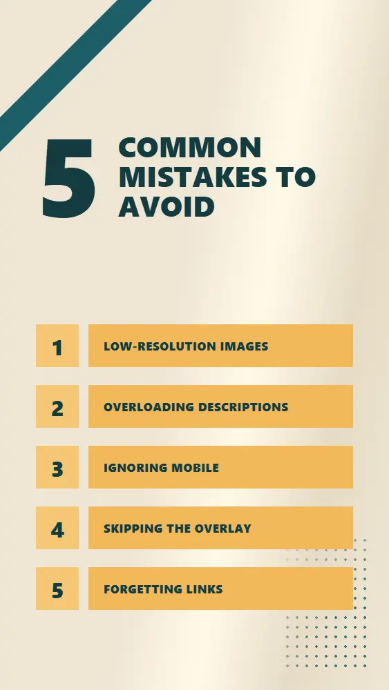
Low-Resolution Images
Using low-quality or small images can instantly make your design look unprofessional, especially when accordion panels expand to full width. Blurry or pixelated visuals reduce user trust and weaken the overall impact of your content. Always use high-resolution images, ideally at least 1200 pixels wide and optimize them properly so they remain sharp without slowing down your page load speed.
Overloading Descriptions
Image accordions are meant to present information in a quick, engaging, and visually driven way. Adding long paragraphs of text defeats this purpose and can overwhelm users. Keep your descriptions brief and focused, just enough to spark interest. If you need to share more detailed information, link each panel to a dedicated page where users can explore further without cluttering the accordion.
Ignoring Mobile
A design that looks great on desktop doesn’t always translate well to smaller screens. If you skip mobile testing, your accordion may appear cramped, misaligned, or difficult to interact with. Always preview your design on tablets and smartphones, and adjust elements like spacing, font sizes, and panel behavior to ensure a smooth and responsive experience across all devices.
Skipping the Overlay
Text placed directly on images without an overlay can quickly become unreadable, especially if the background is bright or visually complex. This can frustrate users and reduce engagement. Adding a dark or semi-transparent overlay helps create contrast, making your titles and descriptions easier to read while still preserving the visual appeal of your images.
Forgetting Links
Each accordion panel is a valuable opportunity to guide users deeper into your website. If you don’t include links or buttons, you’re missing out on potential engagement and conversions. Make sure every panel includes a clear call-to-action to keep users exploring and reduce bounce rates.
Where to Use an Image Accordion on Your Website
The Image Accordion widget works well across a wide range of page types and website niches.
Agency and studio websites use it to showcase services side by side. Each panel can represent a different offering, such as branding, web design, or social media.
Portfolio websites use it to display project categories. A photographer could show portraits, landscapes, and events as three expanding panels.
Team pages use it to feature department sections or individual team highlights, giving each area its own image and short description.
Landing pages use it to present feature benefits in a compact, interactive way that keeps visitors engaged longer than a plain list.
If you want to explore more interactive layout options, check out the Image Hotspot widget for a different approach to visual storytelling, or take a look at the Gallery Filter extension for filterable portfolio layouts.
Take Your Website Further with Animation Addons Pro
The free version of Animation Addons gives you a solid Image Accordion widget with full content and style control. If you want to push further, Animation Addons Pro unlocks 100+ widgets, 25+ GSAP-powered animation extensions, and over 300 full website templates that include pre-built accordion sections you can import and customize in minutes.
Pro plan features like the scroll-based animation extension, cursor effects, and the custom animation builder give your accordion panels a whole new level of motion and interactivity. Instead of a static expand effect, you can add smooth entrance animations, scroll triggers, and hover interactions that make every section feel premium.
Conclusion
Building an image accordion in WordPress does not require a developer, a custom theme, or any JavaScript knowledge. With Animation Addons for Elementor, the entire process takes just a few minutes inside the Elementor editor. You add your images, fill in your content, choose your colors, and publish.
The result is a polished, interactive section that keeps visitors engaged and helps your website stand out from standard static page layouts.
Ready to get started? Install Animation Addons for free and try the Image Accordion widget on your next project. If you run into any questions, the Animation Addons documentation has detailed guides for every widget and extension.
Leave a Reply