 Login
Login
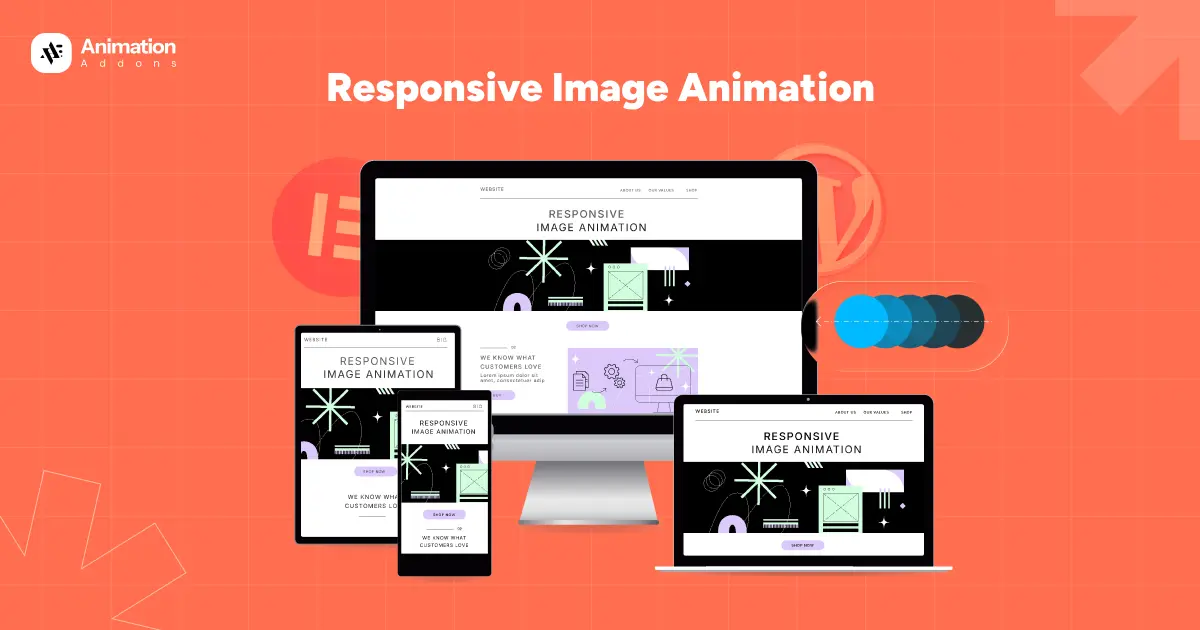
In today’s digital world, visuals play a powerful role in capturing attention, and image animations have become a key part of modern web experiences. But with users browsing from different devices like desktops, laptops, tablets, and smartphones, traditional image animations often fail to perform smoothly everywhere. This is where upgraded responsive image animation comes in.
It ensures that animations automatically adjust to different screen sizes, resolutions, and platforms without losing quality or slowing down the page. It not only enhances visual appeal but also improves engagement, load speed, and accessibility. In this blog, we explore how these improved techniques work and why they matter for modern web design.
What is Responsive Image Animation?
Responsive image animation refers to visual effects applied to images that adapt automatically to different devices, screen sizes, and display environments. Unlike traditional animations that behave the same way everywhere, responsive animations are designed to be flexible. It plays a crucial role in enhancing user experience, making websites more interactive and visually consistent across devices.
The main idea behind responsive animation is to maintain consistency without compromising performance. This ensures faster loading, better usability, and a more balanced visual experience.
Another key part of responsive image animation is using modern technologies like CSS, SVG, and lightweight JavaScript libraries that support scalable effects. These tools help developers create animations that remain crisp across different resolutions.
Overall, responsive animation like responsive fade animation, responsive text animation aims to deliver engaging visuals that feel smooth, modern, and user-friendly on every platform. It ensures the animation remains smooth, clear, and visually appealing whether viewed on a mobile phone, tablet, or large desktop monitor.
Key Features of Upgraded Responsive Image Animation
Upgraded responsive image animation brings a smarter, more flexible approach to how visuals behave across devices. Below are the core elements that make upgraded responsive animation truly effective.
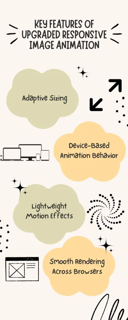
Adaptive Sizing
Adaptive sizing allows image animations to scale automatically based on the user’s screen size and resolution. Instead of one fixed dimension, images adjust proportionally to small mobile screens, medium tablet layouts, and large desktop displays. This prevents distortion, stretching, or cropping. With adaptive sizing, animations remain visually sharp, properly aligned regardless of the device and reduces unnecessary data usage.
Device-Based Animation Behavior
Different devices have different capabilities, and upgraded responsive animation recognizes this. Desktop users may enjoy more detailed or complex motion effects, while mobile users might see a simplified or smoother version to reduce battery and data consumption. This ensures a more intuitive and comfortable user experience tailored to each device.
Lightweight Motion Effects
Heavy animations can slow down pages. Upgraded responsive image animation focuses on lightweight motion effects that deliver visual appeal without affecting load speed. These effects are created using optimized CSS transitions, SVG animations, or minimal JavaScript. By keeping animations small and efficient, websites maintain fast performance while still engaging users with subtle, elegant visuals.
Smooth Rendering Across Browsers
Not all browsers interpret animations the same way. Upgraded responsive animations use modern, widely supported techniques to ensure smooth rendering across Chrome, Firefox, Safari, Edge, and mobile browsers. This includes using standardized CSS properties, GPU-accelerated transitions, and fallback styles for older browsers.
Responsive Image Animation Control Across All Devices [Updated Version]
Responsive image animation has evolved significantly over the years. Earlier methods focused mainly on adjusting image size, while modern techniques now adapt the animation itself. Below is a clear comparison between the old version and the updated version of responsive animation.
Old Version of Responsive Image Animation
In the earlier days, responsive animation was mostly limited to resizing images to fit different screens. The animation effects themselves stayed the same across all devices, regardless of performance capability or screen resolution. This often led to issues such as slow loading, lagging transitions, or broken effects on smaller devices.
For example, in the older version of our responsive animation setup, we used different reveal animation effects for each device. On desktop, the image revealed from the left, while on laptops it revealed from the right. For tablets, the image came in from the bottom, creating a vertical motion. Only for the mobile version, we used a scale animation, starting small and growing into view.
However, the main issue with this older method was that when we applied the scale animation for mobile, the scale animation replaced the reveal animations across all platforms, even though each device was supposed to have its own unique effect. This caused inconsistency and made the animations behave the same everywhere, instead of being tailored to each screen size.
This limitation is one of the key reasons we moved to a more refined, updated approach ensuring every device keeps its own animation without affecting the others.
Updated Version of Responsive Image Animation
The updated version takes a far more user-centered approach. Modern responsive image animation adjusts both the visuals and behavior based on the device type, screen resolution, interaction method, and performance conditions. For example, desktop users may experience richer, layered animations, while mobile users receive simplified, faster-loading effects.
Below, we demonstrate how image animations can be made fully responsive across all platforms. This section highlights the steps and features that ensure smooth and adaptive animations on every device.
Across desktop, laptop, tablet, and mobile devices, we use the Fade animation to ensure a simple, clean, and consistent visual effect. Fade works beautifully on every screen size because it’s lightweight, smooth, and non-distracting. To trigger the animation, we apply the Scroll On setting for all platforms. This means the animation begins only when the user scrolls to the image, creating a natural and engaging viewing experience.
By using the same fade effect across all devices, the design stays uniform and visually harmonious. Nothing changes or breaks when switching between different screen sizes. The fade animation loads smoothly, performs reliably, and delivers a polished, responsive experience for every user, no matter what device they use.
Approach to Responsive Image Animation Across All Platforms
Our approach to responsive image animation focuses on delivering a smooth, visually appealing experience across every device like desktop, laptop, tablet, and mobile. We ensure that each animated image automatically adapts to different screen sizes through flexible layouts, adaptive image scaling, and optimized animation settings.
First, select the image you want to animate. On the left panel, you’ll find the Image Animation options under Animation Addons. Here, you can choose from various animation styles such as reveal, scale and stretch. These effects help bring images to life and make the overall design more engaging.
The data-ease attribute in GSAP allows you to make animations smoother and more natural. It helps control how fast or slow an animation progresses at different points for a more polished effect.
We also use Enable on Editor, a feature that allows you to preview and adjust animations directly inside the editing interface. This gives you real-time control without having to switch between editor and preview mode.
Desktop Version
For the desktop version, we use the reveal animation, which makes the image smoothly appear as the user scrolls. To control how the animation feels, we apply power2.out as the easing. This easing makes the animation start a bit faster and finish smoothly, giving it a natural, polished look on larger screens.
Laptop Version
For the laptop version, we use the Reveal image animation so the image appears smoothly as the user scrolls. For the easing, we apply bounce, which adds a playful, bouncy finishing effect. This makes the animation feel lively and engaging while still remaining smooth on laptop screens.
Tablet Version
For the tablet version, we use the Scale image animation. The image starts smaller with a scale of 0.5 and grows to its full size at scale 1 as the user scrolls. This creates a smooth zoom-in effect that feels natural and works perfectly on tablet screens.
Mobile Version
For the mobile version, we use the Scale image animation, starting the image at scale 0.5 and ending at scale 1. This gentle zoom-in effect works well on smaller screens, making the animation feel smooth, clean, and easy to view on mobile devices.
Across desktop, laptop, tablet, and mobile views, we apply different image animations to match the behavior and performance of each device. Every animation is optimized to run smoothly, maintain consistent timing, and stay perfectly responsive. Also, non of the animation overlaps with one another. This ensures a unified visual experience, nothing overlaps, breaks, or changes unexpectedly across platforms, giving users a seamless and polished design everywhere.
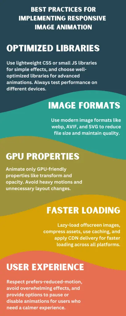
Best Practices for Implementing Responsive Image Animation
Implementing responsive image animation well means balancing beauty with speed and accessibility. A representation is shown through infographic for better understanding –
Final Words
Upgraded responsive image animation is now an essential part of modern web design, helping websites look polished, interactive, and consistent across every device. By adapting animation styles, sizes, and behaviors for desktop, laptop, tablet, and mobile screens, designers can create smooth and engaging visuals without sacrificing speed or performance.
As the digital world continues to evolve, mastering responsive image animation is a powerful way to enhance both design quality and user satisfaction.
Leave a Reply