 Login
Login
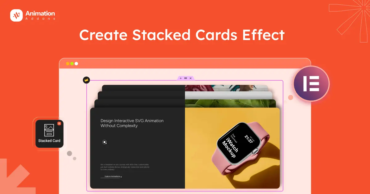
Modern websites use motion to guide users, not just decorate pages. One powerful technique is the stacked cards scroll effect, where content appears step by step as visitors scroll.
This improves focus and makes long pages feel more engaging.
However, stacked cards only work when used correctly.
In this guide, you’ll see when to use them, when to avoid them, and how to create the effect in Elementor using either a plugin or custom GSAP code.
When Should You Use Stacked Cards In Elementor?
Stacked cards work best when content needs focus and pacing. This helps users move step by step instead of seeing everything at once.
It’s very powerful, but only when used in the right places.
💡
Pro Tip:
Use stacked cards only in important sections like hero stories, feature highlights, or product details. Using them less often makes the effect more powerful and keeps users from feeling overwhelmed.
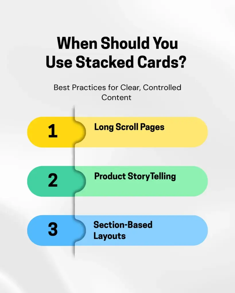
Long-Scroll Pages
Stacked cards are ideal for long pages where content needs to be revealed gradually. As users scroll, each card takes focus, making long content easier to follow and less overwhelming.
When to Use: Use this on landing pages where content should show little by little as people scroll down. Each card appears one at a time, so long content feels easier to read.
The “Avoid” Rule: Do not use the effect if the page is too short or fits on one screen. Moreover, if someone has to scroll just to read one small paragraph, it can feel annoying instead of helpful.
Product Storytelling
Stacked cards work well for explaining a product in a clear sequence, such as features, benefits, or workflows. It helps users understand the product step-by-step without jumping around the page.
When to Use: This is great for showing features in order, step-by-step benefits, or a “How It Works” section. It helps people follow the story the way you planned it.
The “Avoid” Rule: Do not use stacked cards when you want people to compare things. If someone needs to see “Product One” and “Product Two” at the same time, stacking them makes them scroll up and down again and again. It can feel frustrating.
Section-Based Layouts
For pages with clear sections like features, services, or use cases, stacked cards guide attention smoothly from one section to the next. It helps control reading order and keep users engaged while scrolling.
When to Use: Use this when you want people to read things in a certain order. It works well in sections like “Our Services” or “Industry Use Cases,” where each part should be seen one after another.
The “Avoid” Rule: Do not use this when everything needs to be seen at the same time. If your design has big grids, tables, or comparison sections that should be viewed together, stacking them will break the layout and make it confusing.
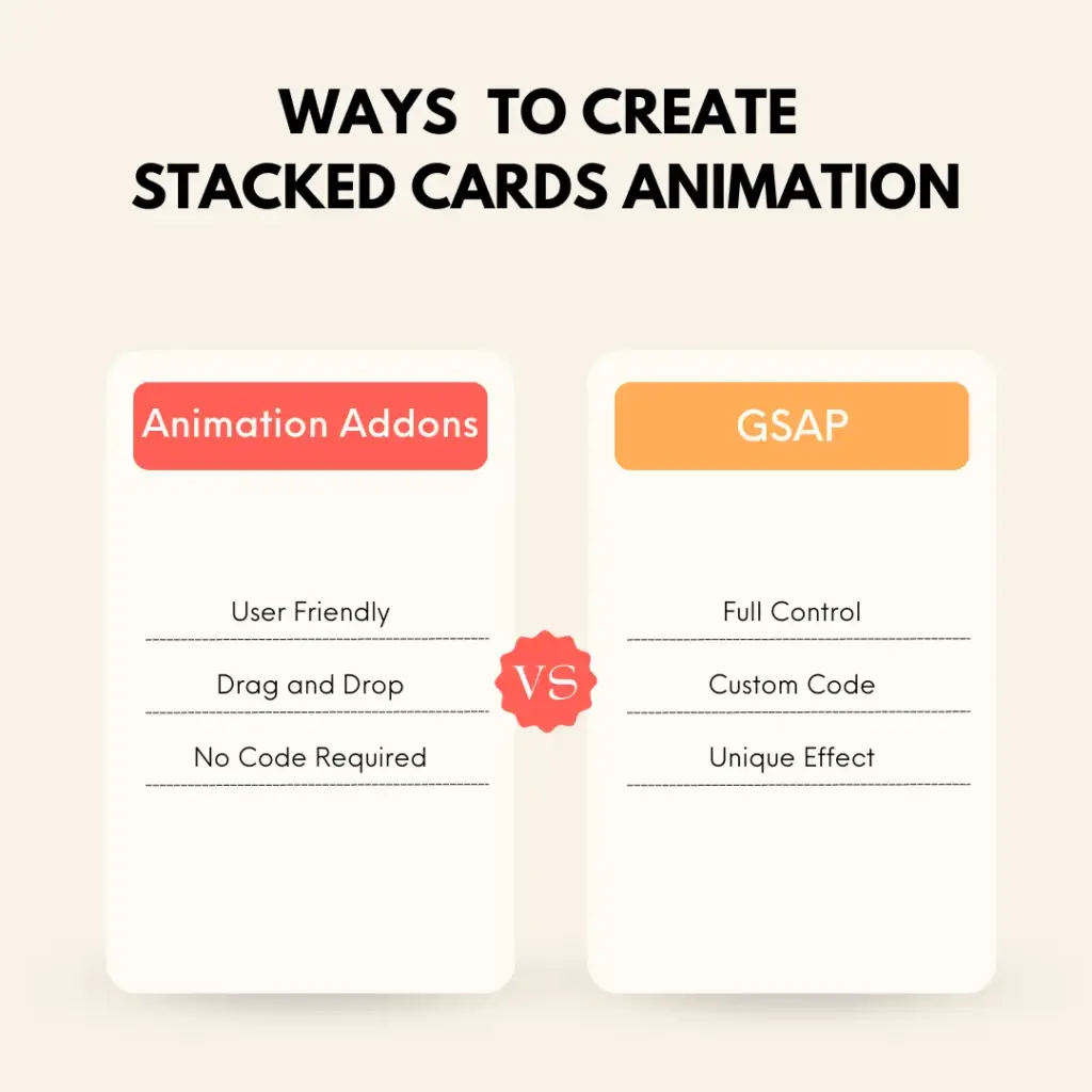
Ways To Create Stacked Card In Elementor
In this section, you will see two ways to add stacked card animations:
- WordPress Plugin (No-coding Required)
- GSAP Library (Custom Code)
If you are a creative developer and want to avoid complex coding, the no-code method using a WordPress plugin is a great choice. On the other hand, if you want full control over the stacked card animation through code, the GSAP library is the best option.
Basically, the right option depends on your skill level, timeline, and how much control you need.
Let’s take a look at each one:
Animation Addons (WordPress Plugin)
Animation Addons is one of the most powerful plugins out there. It comes with many widgets, extensions, and ready-to-use templates.
You also get hundreds of full websites, thousands of pages, and many prebuilt sections, so you can build animated layouts quickly without starting from zero.
The best part is that it helps you create animations without coding.
On top of that, with this plugin, you can easily add animations to your existing website or build a new one from scratch. It’s best for beginners, designers, and teams who want reliable results without spending time on custom development.
The plugin handles scroll behaviour, card stacking, spacing, and animation logic for you.
GSAP Library (Custom Code)
Another great option for creating the stacked cards effect is GSAP. By combining GSAP timeline with Scrolltrigger animation, you can control exactly each card’s pins, overlaps, scales, or fades on scroll.
This allows you to build smooth, scroll-driven stacking effects instead of simple visual tricks. With GSAP, you are not limited to preset settings. You can change the timing, spacing, page speed, and how it works on different devices.
However, this method needs strong JavaScript skills and careful work to keep everything running smoothly. Built the right way, it gives you the most flexible and professional stacked card effect in Elementor.
Now you know a couple of ways to add stacked card animations to your site. In the next section, let’s look at a step-by-step guide to adding the stacked animation effect.
How To Add Stacked Cards Effect in Elementor
Let’s look at each method individually and see, step by step, how you can add a stacked card effect to your site.
Animation Addons
Adding a Stacked Cards animation in Animation Addons is easy. Most settings are already set for you, so you only need to change a few options to get started.
However, you can customize it based on your choice as well.
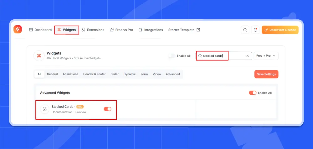
Before you start, make sure you have installed the Animation Addons plugin on your WordPress site. Also, make sure the extension is enabled inside the plugin settings.
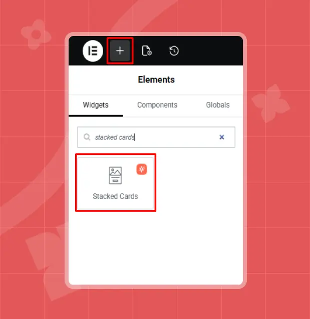
Step 1: Unlock the Stacked Cards
Click the‘+’ icon, type Stacked Cards in the search bar, then select it.
Step 2: Customize Your Card Content
After selecting Stacked Cards, you’ll see three customization options: Layout, Content, and Animation.
You can customize the stacked cards based on your needs. Let’s begin with Layout.
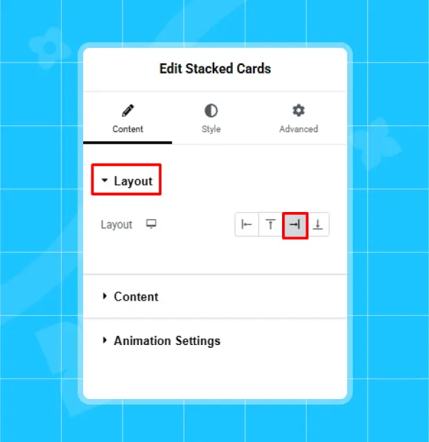
Layout
In Layout, choose Left, Top, Right, or Bottom to set where the cards appear and the direction they animate from.
For example, it’s set to ‘Right’ here, but you can choose any option you prefer.
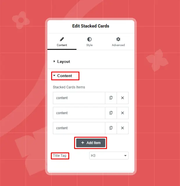
Content
For example, three items are added here, but you can add more by clicking ‘+Add Item’. Next, set the content ‘Title Tag’ according to your preference; here, it’s set to H3.
Now, click on ‘Content’ to customize the stacked card items as you like.
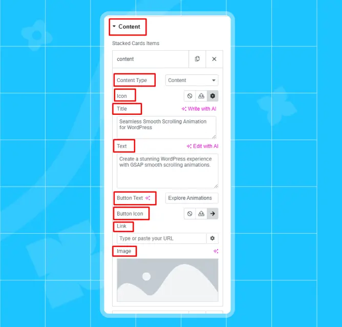
Right after clicking on content, you will have all the customization options. Start with content type.
Content Type: Content type has two options: Content and Saved templates. The Content option lets you make cards right in the widget, and Save Template lets you use a ready-made Elementor template for the cards.
For instance, it’s set to Content here, but you can choose any option you prefer.
Icon: From the Icon option, you can upload a custom icon or choose one from the library. The choice is yours.
Title: Set the title however you like. For example, it’s set to ‘Seamless Smooth Scrolling Animation for WordPress’ here.
Text: Next, in the Text option, you can add text animation according to your content.
Button Text: Button Text lets you choose what appears on the button. For example, it’s set to ‘Explore Animation’ here, but you can enter any text you like.
Button Icon: In Button Icon, you can select an icon or upload a custom one of your choice. For example, here it’s selected to an arrow icon.
Link: Link settings turn your card into a clickable link. You can paste any link as per your choice. However, no link is set here.
Image: In the Image option, you can choose any image you like.
- Note
- Similarly, you can customize your other ‘Content Items’ the same way.
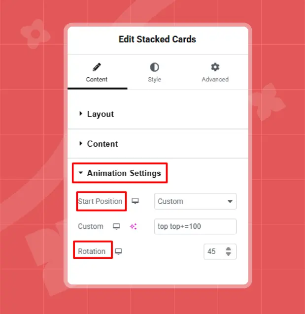
Step 3: Set How the Cards Flow
Decide where the cards appear on the screen and how they move. Start Position sets the entry point, like top, center, bottom, or a custom spot. Rotation turns the cards a little to make them look stacked.
Animation Settings
Animation settings options let you control where the animation begins on the screen. Let’s take a look at what each option does:
Start Position
- Custom: You can choose your own starting spot.
- Top Top: Animation starts at the top of the screen or section.
- Top Center: Animation starts from the top, in the middle.
- Top Bottom: Cards start from the top, near the bottom side.
- Center Top: Animation starts in the middle and moves from top.
- Center Center: Cards start from the very middle.
- Center Bottom: Animation starts in the middle and moves from the bottom.
- Bottom Top: Cards start from the bottom, but near the top side.
- Bottom Center: Animation starts at the bottom and moves from the middle.
- Bottom Bottom: Cards start from the very bottom corner.
For example, it’s set to ‘Top Top’ here. But you can choose any option as per your choice.
Rotation
Rotation makes the cards tilt or turn a little, so they look stacked on each other. For example, it’s set to 45 here, but you can choose any value you prefer.
Final Result
GSAP ( Custom Code)
Using GSAP gives you complete control over how stacked cards behave during scroll. You decide the timing, easing, scroll distance, pin duration, and how each card overlaps or transforms. This method is ideal for developers who want custom animation logic instead of relying on preset settings.
Below is a step-by-step implementation of stacked cards using GSAP and ScrollTrigger.
Step 1: Create the Card Structure in Elementor
Add an HTML widget inside your Elementor section and insert this structure:
					<section class="stacked-section">

  <div class="stacked-wrapper">

    <div class="stacked-card card-1">Card 1</div>

    <div class="stacked-card card-2">Card 2</div>

    <div class="stacked-card card-3">Card 3</div>

  </div>

</section>
Each stacked-card represents one layer in the stack.
Step 2: Add the Required CSS
The section needs scroll space, and the cards must sit on top of each other.
					body {

  margin: 0;

  font-family: sans-serif;

}

.stacked-section {

  position: relative;

  height: 300vh;

}

.stacked-wrapper {

  position: relative;

  height: 100vh;

}

.stacked-card {

  position: absolute;

  inset: 0;

  display: flex;

  align-items: center;

  justify-content: center;

  font-size: 40px;

  color: white;

}

.card-1 { background: #111; }

.card-2 { background: #444; }

.card-3 { background: #777; }
The extra height on .stacked-section creates scroll distance for the animation.
Step 3: Load GSAP & Create Scroll Timeline
After loading GSAP and ScrollTrigger, register the plugin and configure a timeline with ScrollTrigger. This setup links scroll behavior to the stacked card animation.
- Note
- Make sure both GSAP and ScrollTrigger are properly loaded before running the script. Otherwise, the animation will not work.
					gsap.registerPlugin(ScrollTrigger);

const cards = gsap.utils.toArray(".stacked-card");

const tl = gsap.timeline({

  scrollTrigger: {

    trigger: ".stacked-section",

    start: "top top",

    end: "+=2000",

    scrub: true,

    pin: ".stacked-wrapper",

    markers: true

  }

});

cards.forEach((card, i) => {

  if (i === 0) return;

  tl.from(card, {

    yPercent: 100,

    scale: 0.95,

    duration: 1

  }, i);

  tl.to(cards[i - 1], {

    scale: 0.85,

    duration: 1

  }, i);

});
Each new card slides upward while the previous card slightly scales down. This creates the layered stacked cards effect.
💡
Pro Tip:
Always animate transform and opacity instead of top or left properties. This keeps the animation GPU-accelerated and prevents layout reflows that can cause scroll lag.
Performance Tips for Stacked Card Animations
Stacked Card animation looks smooth and premium when optimized properly. However, scrolling, pinning, layering, and multiple transforms can quickly increase performance load if not handled carefully.
Follow these best practices to keep the animation fast and stable across devices.
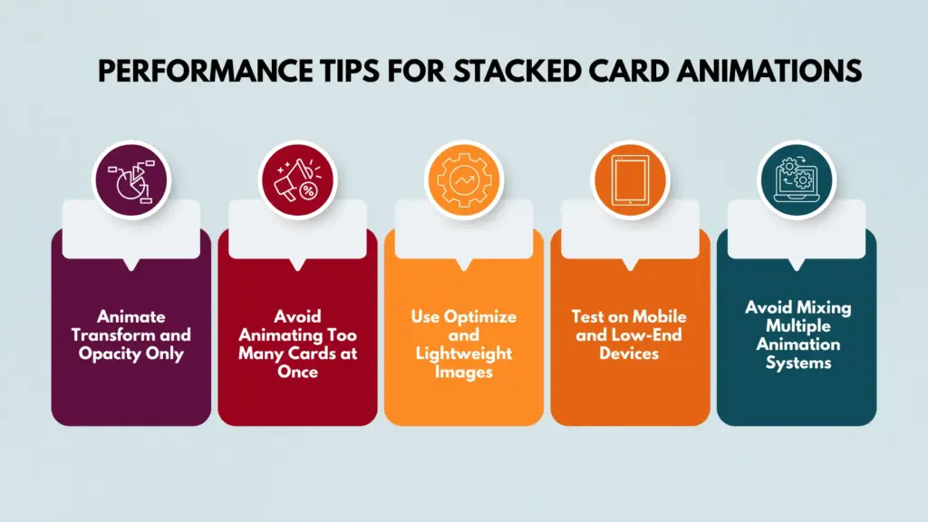
Animate Transform and Opacity Only
For better performance, animate only transform and opacity. These properties are GPU-accelerated and do not trigger layout recalculation or repaint.
Avoid animating properties like top, left, width, height, or box-shadow. They force a layout reflow. This can cause lag and make scrolling feel jumpy.
Avoid Animating Too Many Cards at Once
Stacked layouts can feel heavy if too many elements animate at the same time. Multiple layers moving and scaling together force the browser to do more work, which can reduce performance, especially on mobile devices.
Keep the number of stacked cards in one section reasonable. Three to five cards usually create a strong visual impact without overloading the browser. If additional content is needed, split it into multiple sections instead of stacking everything in a single scroll sequence.
Use Optimize and Lightweight Images
Large background images inside stacked cards can slow things down. Because the cards overlap and stay pinned while scrolling, heavy images use more memory and add extra rendering work.
Compress images before uploading them. Use modern formats like WebP whenever possible. Avoid ultra-high-resolution backgrounds unless they are truly needed. Smaller image sizes reduce GPU load and help the animation run more smoothly.
Test on Mobile and Low-End Devices
Stacked scroll effects may look smooth on powerful desktop computers, but performance can drop on low-end mobile phones. Always test on real mobile devices instead of relying only on browser developer tools.
Watch for signs like choppy movement, slow scroll response, or lag when several cards animate at once. If performance drops, reduce the animation complexity, simplify the transforms, or shorten the scroll distance to keep everything running smoothly.
Avoid Mixing Multiple Animation Systems
Do not combine GSAP, CSS keyframe animations, and other animation libraries on the same stacked section. Mixing systems can cause timing conflicts, layout thrashing, and unpredictable behavior.
Choose one animation system and stay consistent. If you use GSAP for stacking, let GSAP handle all related animations in that section. This keeps scroll synchronization stable and prevents performance issues.
Common Mistakes to Avoid
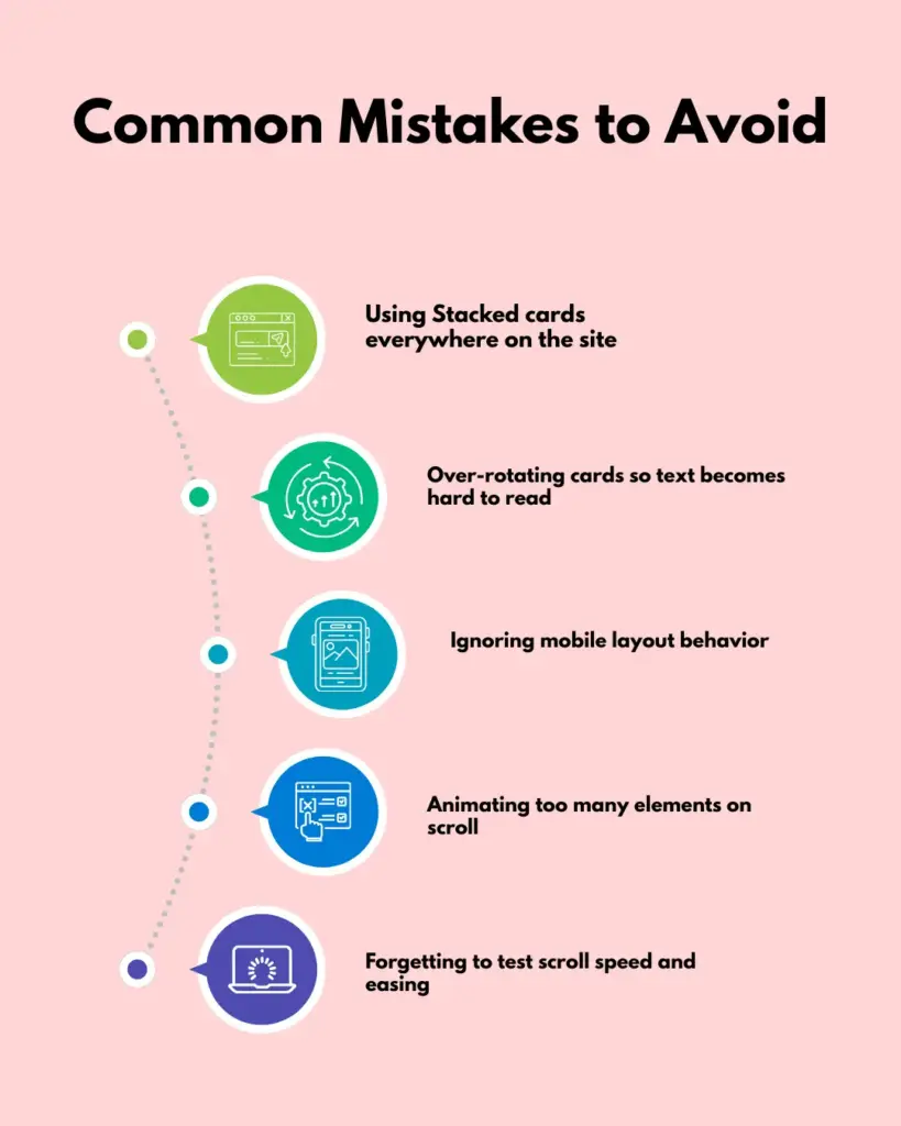
Stacked card animations can make your design look better when used the right way. But small mistakes can hurt usability, readability, and performance.
Therefore, before using stacked cards on your page, take a moment to check the common mistakes below and make sure your design avoids them.
Using Stacked cards everywhere on the site
Stacked cards create strong focus and storytelling impact. Overusing the effect across many sections can make it feel repetitive and reduce its visual strength. Use stacked layouts only for key moments like feature highlights or product storytelling.
Over-rotating cards so text becomes hard to read
Small rotation values can add depth, but excessive angles reduce readability. Content should always remain clear and easy to scan. If the rotation makes users struggle to read text while scrolling, the design is working against usability.
Ignoring mobile layout behavior
Stacked animations may feel smooth on desktop, but heavy or awkward on mobile devices. Long pinned sections can create uncomfortable scrolling experiences on small screens. Always test and adjust scroll distance, animation timing, and stacking logic for mobile responsiveness.
Animating too many elements on scroll
Adding motion to every element inside a stacked section can overwhelm users and hurt performance. Focus on the main card transition and keep supporting animations subtle. Clean and controlled motion feels professional, while overloaded motion feels chaotic.
Forgetting to test scroll speed and easing
Scroll-driven animations depend on proper timing. If the scroll duration is too short, the transition feels rushed. If it is too long, users may feel stuck in the section. Test different scroll distances and easing curves to ensure the stacking effect feels smooth and natural.
Wrap Up
The stacked cards effect is more than just a visual trend. Used correctly, it improves focus, strengthens storytelling, and makes long pages feel structured and intentional.
Instead of overwhelming visitors with too much information at once, it guides them step by step through your content.
Balance is what matters most. Place stacked cards in meaningful sections, pay attention to performance, and test across different devices. A thoughtful implementation can transform a standard layout into a smooth, professional, scroll-driven experience.
FAQs
Can you use stacked cards in comparison sections?
Stacked cards are not recommended for comparison layouts. When users need to view two or more items at the same time, stacking forces them to scroll back and forth, which reduces usability. Grid or table layouts work better for comparisons.
Should you use stacked cards on every page?
Using stacked cards everywhere can reduce their visual impact and make the design feel repetitive. They work best when applied strategically in important storytelling sections rather than across the entire website.
Which method is better: a plugin or GSAP?
The better method depends on your goals and technical skill level. A plugin is ideal if you want a faster setup with minimal complexity. GSAP is the better choice if you need advanced control and fully customized animation behavior. For most marketing websites, a plugin is sufficient, while creative projects often benefit from GSAP’s flexibility.
How many stacked cards should I use in one section?
For the best balance between design impact and performance, it is recommended to use three to five cards in a single section. Adding too many layers can make the animation heavy and reduce smoothness, especially on mobile devices.

Leave a Reply