Most websites tell. A few actually show.
That’s where animation makes your site feel alive. It makes your offer clear and easy to follow.
For example, on a fashion site, a dress fades in as you scroll. A button lights up when you hover. Little animations like these keep visitors active and make the site feel more lively.
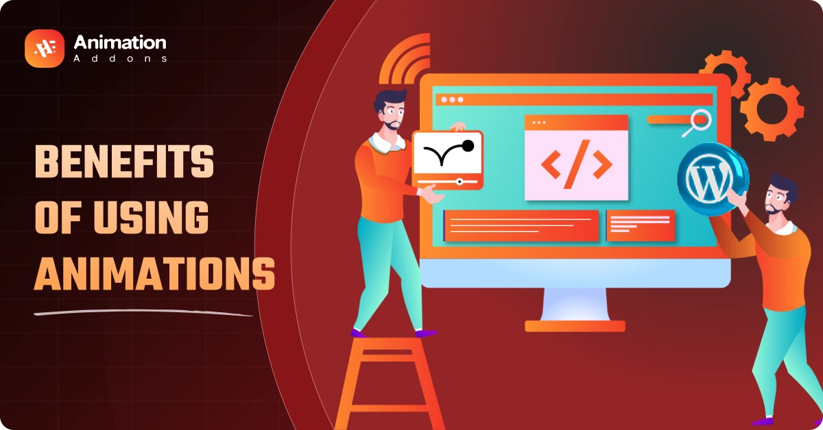
In this blog post, we will show you the real benefits of using animations on a website. Not just how it looks, but what it does for your users and your business.
Benefits of Using Animations on a Website
Website animations do more than just look good. They bring energy and motion to the page. Instead of just scrolling for information, users move through the site like it’s a small journey.
It makes your website easier to remember and harder to forget.
1. Helps People Stay Longer on Your Website
Web animations for user experience are often subtle but effective.
When you’re building and launching websites that demand heavy design elements, people expect a bit of motion. If a website just sits there, it feels like something’s missing.
Even tiny things like a fade-in while you scroll or a button that moves when you hover can make a difference. They catch your eye, make the page feel alive, and gently say, “Hey, don’t leave yet.”
And to be honest, those extra seconds can lead to more revenue and better SEO.
2. Makes Hard Ideas Easier to Understand
Some things are easier to show than tell. Too much text can feel boring, even if it’s important.
Animation can fix that problem. Lottie animations work great for explaining steps visually, especially for technical products.
Web animations aren’t just for show. They help people understand things faster. When something is hard to explain, a little movement can make it clear.
3. Shows People Where to Go and What to Click
Good design looks clean. Great design tells people where to go next. Animation helps with that. It gives users gentle direction without needing signs or arrows.
For example, scroll animations are one of the easiest ways to guide users through your content naturally. Even a small bounce or shift helps users figure things out without thinking too hard.
Here are a few ways animation improves direction on a page:
- Highlight important areas — Buttons, CTAs, or links can react slightly on hover.
- Guide the flow — Elements entering one by one show where the eye should move.
- Prevent confusion — Motion hints at what is interactive and what is not.
These micro-interactions in web design make the experience feel smoother and easier to follow.
4. Gives Quick Feedback When Users Click or Scroll
People want to feel in control when they use a website. If they click something and nothing happens, even for half a second, they get confused. But if you place an animation there, the scenario changes entirely.
You click a button, and it shrinks just a bit. You miss a form field, and the box gives a quick shake. Small things like these help you feel what’s happening. These small touches are part of good interactive website design.
Common examples of feedback animation:
- Click feedback — Buttons shrink or change color briefly.
- Scroll feedback — A sticky header appears or disappears.
- Loading indicators — Simple spinners or progress bars.
These animations keep people engaged and focused on your website. They know something is happening, and therefore, they don’t get distracted and wait.
But if there are no animations, then there is a high chance that people won’t notice an important button, or in the worst case, leave the website if a page doesn’t load quickly.
5. Makes Your Brand Easy to Remember
Good branding is more than colors and logos. It’s about how your website feels. Animation plays a big part in that. Smart animations for website design help build a consistent brand tone across every page.
A custom-loading animation, an animated logo, or even the way sections move can all say something about your brand. Animation for branding is not about showing off. It’s about creating a clear and consistent mood that people remember.
If someone visits ten websites in a day, most will blur together. But the one that moves with purpose, that one usually stays in their mind.
Here are some common tools used to create that kind of brand experience:
| Tool or Method | How It Helps With Branding | Skill Level Needed |
| GSAP Animations | Let’s you create a custom, smooth motion that feels unique | Medium to High |
| Lottie Animations | Lightweight and great for logos or explainer icons | Low to Medium |
| No-Code Tools | Makes it easy to add motion using a page builder | Low |
Even a small animation can leave a strong impression when it matches the tone of your brand and feels intentional. It doesn’t need to be complex. It just needs to feel right.
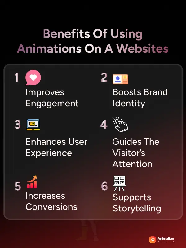
6. Perceived Performance: Makes the Site Feel Faster
Websites do not always load instantly. However, users are more patient when something is happening on the screen. Animation helps fill those small wait times and makes your site feel faster, even if it is not.
This is called perceived performance.
It is not about improving speed. It is about improving how fast your site feels. A few simple motion tricks can make a big difference.
Here are common examples:
- A progress bar that shows loading during form submission.
- A fade-in animation for images while the rest of the page loads.
- A scroll animation that brings in content section by section.
Because of these animations, people do not feel like they are waiting. This psychological event can lower the bounce rate by a great deal.
7. Brings Attention to Important Buttons or Messages
Let’s say you are inside an e-commerce or affiliate website, reading product descriptions or specifications. And you notice the “Add to cart” or “Buy Now from Amazon” button is giving off a soft light every few seconds.
These are animations that increase conversions.
Our brains are wired to notice motion. If something moves, we look. Fairly decent websites use this trick as a way to guide you on where to click and what to do next.
Let’s give an example of a website most of us use – Netflix.
When you hover over a movie, it jumps out slightly for a quick look at the details. You have the feeling that the site is listening to you.
And it’s very hard to leave Netflix. Of course, they have the best movie and TV show database in the world.
However, the animation effect helps them to hook users and not let them leave the site easily.
A few, relatively common animations people use to get people to sit up and take notice of the good stuff.
Here are some fairly standard animations that can get people to pay attention to important stuff:
| Animation Style | Where to Use It | How It Helps |
| Button hover | Buy now, Sign up | Shows it’s clickable |
| Soft glow/pulse | Promotions, popups | Makes it stand out |
| Slide-in messages | Alerts, chat boxes | Hard to miss |
| Tiny form effects | Errors, missing fields | Helps fix mistakes easily |
NOTE: But don’t use too many. If everything moves, nothing stands out. Use just enough.
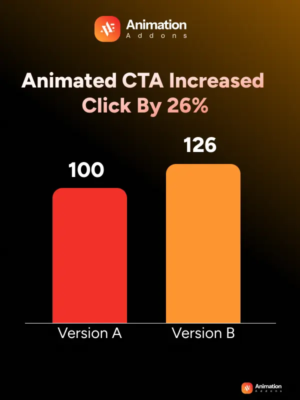
Why You Should A/B Test Every Animation?
Animations aren’t just decorations. Their decisions. And every decision should be tested.
In a case study by VWO, a SaaS company tested a static CTA button against a slightly animated version that pulsed every 8 seconds. The result? The animated version improved click-through rate by 26%. (Source: VWO A/B Testing Case Studies)
But this doesn’t always work.
Another test on an e-commerce checkout page found that a bouncing “Pay Now” button actually decreased conversions by 11%. People thought it was buggy. Lesson? Subtle works. Gimmicks don’t.
Use tools like:
- Google Optimize (free)
- VWO
- Hotjar
8. Make Your Website Feel More Fun and Modern
Some websites feel boring. Like old brochures. Just words and pictures, nothing reacts.
But when a site moves a little, when things slide in, fade in, or bounce, it feels fresh. Like it was made today, not ten years ago.
You can improve engagement with animation by making the site feel more responsive and modern.
People expect websites to feel alive. Even simple moves can do that:
- A section that appears when you scroll.
- A line of text that comes in one by one.
- A button that wiggles just a little.
Stripe does this nicely. Their credit card form flips when you enter your number. It feels fun and clear at the same time. Here are a few animation styles that work well today:
- Scrolling effects – as you scroll, things move in layers.
- Smooth section change – going from one part to another feels natural.
- One-by-one loading – parts of the page appear step-by-step.
- Swipe and drag – works great on phones, feels easy and fun.
9. Makes Your Site Look More Professional
Many people think a “professional” site means no fun. Just plain text, no colors, nothing moving.
That’s not true.
Look at brands like Apple or Tesla. Their websites move but in calm, smooth ways. Pictures slide in. Buttons react softly. Pages don’t just load; they flow.
What makes animation feel professional?
- It moves at the right speed. Not too fast, not too slow
- It stops smoothly.
- It knows when to stop
You Might Not Know: Good animation also helps people feel safe. That’s why banks use it. When you’re filling out a form about money, soft animations help you stay calm and focused.
10. Animations Can Help Your Site Rank Better by Keeping Users Active
First, let’s get something straight: animations don’t have any direct impact on your Google ranking.
No place in the Google algorithm says, “Oh, man, this site is like a bouncy ball, let’s put it on page one.”
Then how does it improve your search engine presence? How much time a user spends on your website is a ranking factor for Google. You’ll find that mentioned in Google’s page experience documentation.
Animation can help people stay on a page for a longer period. If this thing moves, our brain always assumes that something’s important.
Here are some ideas about what can cause users to keep sticking around on your website:
- Sticky sidebars that move as you scroll.
- Smooth horizontal scrolling sections.
- Pinned content that changes step by step while you scroll.
- Split screens that shift or reveal new things as you go.
- Text or images that slide in or fade gently as you scroll.
These small touches can keep users engaged longer.
Additionally, a Nielsen Norman Group study revealed that most users don’t scroll unless prompted to do so. Mild animations may encourage people to stop and linger rather than leave right away.
Risks You Should Know Before Using Animation
Animation can make your site feel alive. But if you’re not careful, it can also slow things down, confuse people, or even make them feel sick.
Here are three risks to know before adding animations to your website.
Too Much Animation Can Confuse or Annoy People
When everything moves, nothing stands out.
If a button slides in, a header bounces, the background shifts, and your text types itself—all at once—visitors stop trying to follow. Their eyes don’t know where to look.
People usually come to your site to read something, buy something, or learn something. Too much motion gets in the way.
It’s not just about distraction. Overuse of animation can make your site feel unprofessional. Keep it simple. Let one or two elements move when needed, not everything on the page.
Some People May Have Trouble Using Moving Websites
Not everyone can handle motion in the same way. For some special users, too much movement can actually be harmful.
- People with vestibular disorders (issues with balance) may feel dizzy or nauseated from fast animations or background shifts.
- People with ADHD or attention challenges might struggle to focus if your page keeps animating every few seconds.
- And in rare cases, flashing or fast-changing visuals can even trigger seizures.
NOTE: To avoid these problems, most modern devices let users choose “reduced motion” in their settings. And your site should respect that.
Large Animations Can Slow Down Your Site
Google has made it clear: page speed matters. A fast-loading website is part of a good user experience and can directly affect how your site ranks in search. (Source: Google Page Experience Update)
But it’s not just about rankings. A slow website can also cost you money.
As page load increases from 1s to 3s, bounce rates can increase 32%. (Source: Think with Google)
Large and complex animations can slow down your website.
Therefore, after adding animations, you should check the page speed. If it slows down either you have to fix it or remove the animation.
| Problem | Why It Slows Things Down | How to Fix It |
| Video backgrounds | High file size, long load times | Avoid using video or compress it heavily |
| Heavy Lottie or SVG files | Large JSON or SVG code can clog up rendering | Optimize files, remove unused paths |
| Unoptimized JS animation libs | Loads extra code that may block the page from rendering | Use lightweight libraries or load only what’s needed |
| Animations outside the viewport | Animations run even when users can’t see them | Use scroll-based triggers or pause off-screen effects |
| Too many animations at once | CPU and memory usage spikes on weak devices | Limit concurrent animations, and stagger them when needed |
Expert Tips:
- Stick to CSS animations for basic hover and fade effects.
- Compress Lottie files and test them on low-end phones.
- Use lazy loading where possible.
- Always check load time using Google PageSpeed Insights.
Special Note on GSAP:
GSAP animations offer full control over timing, scroll triggers, and easing effects. But when you apply GSAP animations on your website, consider these:
- Only import the modules you actually use (not the entire library).
- Use ScrollTrigger, but don’t animate every single scroll event.
- Always measure performance after adding GSAP, and if things slow down, find the issue and fix it.
SEO Myths About Animations (Animations Hurt the Website Speed)
No, Animation Doesn’t Hurt Your SEO.
Some people still believe animation kills search rankings. But let’s be clear: Google doesn’t penalize animation. It penalizes bad performance.
In fact, Google’s John Mueller confirmed that animations built with JavaScript, CSS, or WebGL are fine, as long as the content is crawlable and the page is fast.
Bad practices:
- Hiding essential text in JS that Google can’t read.
- Blocking interaction until animation completes.
- Slowing down the time-to-interactive with heavy animation files.
Good practices:
- Preload text content before animation kicks in.
- Use will-change and hardware-accelerated transforms.
- Test your final site with Google Lighthouse.
So, finally, from our expert opinion: it’s not animation that hurts SEO.It’s when you use it without thinking.
Easy Animation Tips for WordPress and Elementor Users
- Keep it simple: A soft fade or gentle slide is often all you need.
- Focus on key elements: Animate only important buttons, titles, or images.
- Play it once: Allow the animation to run once when it’s needed, and that’s it.
- Keep it quick: The animations at about 0.3 to 0.5 seconds are smooth, not slow.
- Don’t delay content: Display your main message immediately without any delay..
- Check mobile too: Some effects do not translate well to small screens. In that case, turn off animation for smaller screens.
- Respect user settings: If someone chooses reduced motion, follow that.
- Lazy load when scrolling: This keeps your site fast even with scroll-based animations.
Expert Opinion: Sometimes, especially for new users, animations can be very tough to implement. A good WordPress plugin can make it simple without needing code. You just choose what you want, and it handles the rest. A well-built plugin won’t slow down your site either.
Use Animation Addons to Add Beautiful GSAP Animation to Your WordPress Site
If you want to use animations on your website without writing code or getting into technical stuff, Animation plugins for Elementor is a great choice.
You can add movement to buttons, text, sections, or anything else right from the Elementor editor. It works smoothly without any extra setup.
Animation Addons for Elementor come with 150+ ready-made animated templates and 10,000+ pre-built sections. All are built with smooth GSAP transitions, ScrollTrigger, pinning, SVG draw effects, Lottie animations, and more.
You don’t need extra scripts or custom code. It’s already optimized.
And it doesn’t slow your site down. So, it doesn’t hurt user experience or SEO of your website.
Wrapping Up
Animations don’t have to be flashy to work. Even the smallest movement can make a website feel smoother and easier to use. The purpose of animation is to tell your brand’s story and make important parts of your website noticeable. Too many animations without any real goal can ruin the purpose of it.
If people can find things faster, understand your content better, and enjoy browsing your site, that’s the real benefit of using animations on a website.
Use motion with care. Not everything needs to move. But the right animation in the right place can make a big difference.
Keep it simple. Keep it useful. That’s what makes a website feel good to use.
FAQs
Do animations work on all browsers?
Most modern browsers like Chrome, Firefox, Safari, and Edge support CSS and JavaScript animations.
For older versions (like IE11), some effects may not work unless you use fallback styles.
Can animations be used in mobile-first designs?
Yes. But keep them light and fast. Avoid complex effects that lag on slower devices or eat up battery.
How can I keep animations from slowing down my website?
Use compressed files, lazy loading, and avoid animating large images or videos. Test your site with Google PageSpeed Insights to catch slow spots.
Is it okay to animate text content?
Yes, but keep it subtle. Use fades or slight slides. Avoid typewriter effects that delay reading.
What are the best file formats for animated icons?
Use Lottie (JSON) for lightweight animated icons. SVG and GIFs work too, but GIFs are heavier and don’t scale well.
Can animations improve accessibility?
If used carefully, yes. Animations that give feedback (like button clicks) help users understand what’s happening. Just make sure they don’t distract or trigger motion sensitivity.
Leave a Reply