 Login
Login
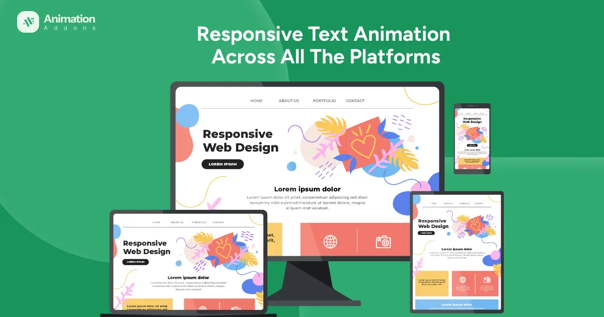
In today’s multi-device world, users expect websites to look flawless and function smoothly no matter what device they’re using. That’s why being perfectly optimized and responsive across all platforms like desktop, laptop, tablet, and mobile is no longer a luxury; it’s a necessity.
Whether someone visits from a widescreen desktop or a compact mobile phone, every layout, image, and text element adjusts perfectly to fit their screen. Animation Addons focus on crafting designs that combine visual appeal with flawless performance, giving your visitors a seamless experience on every platform. Our goal is simple to make your website look stunning, load fast, and perform perfectly, no matter where or how your audience chooses to connect.
What Is Responsive Design?
Responsive design is a web development approach that ensures a website automatically adjusts and looks perfect on any device whether it’s a desktop, tablet, or smartphone. Instead of creating separate versions for each screen size, responsive design uses flexible layouts, fluid grids, and CSS media queries to adapt the content dynamically. This means images resize properly, text remains readable, and navigation stays user-friendly across all platforms.
The core idea behind responsive design is to deliver a seamless user experience, no matter how or where visitors access your site. In short, responsive design is the foundation for modern web development making your website accessible, engaging, and optimized for every device and user.
Why Multi-Platform Optimization Is Essential?
In today’s digital era, people access websites through a wide range of devices: desktops, laptops, tablets, and smartphones. Each platform has different screen sizes, resolutions, and user behaviors. Multi-platform optimization ensures that your website delivers a consistent, high-quality experience across all of them.
- Well-optimized website automatically adapts its layout, visuals, and functionality to fit the user’s device.
- Leads to improved user experience, keeping visitors engaged longer and reducing bounce rates.
- Mobile responsiveness directly impacts your Google ranking with fast loading times and consistent user experiences.
- Strengthens brand consistency by ensuring your message, visuals, and user journey remain uniform across all devices.
Responsive Animation Control Across All Devices [Updated Version]
Responsive Animation Control ensures that animations adapt seamlessly across all devices, from older models to the latest versions. It automatically adjusts motion effects and performance settings to deliver smooth, visually engaging experiences without compromising speed or compatibility.
Old Version of Responsive Animation
In the older version of our responsive design system, animations were limited in flexibility. Whenever you applied an animation to a text in mobile view, that same animation would automatically apply to all other devices including desktop, laptop, and tablet. This meant you couldn’t create unique animation experiences for different screen sizes.
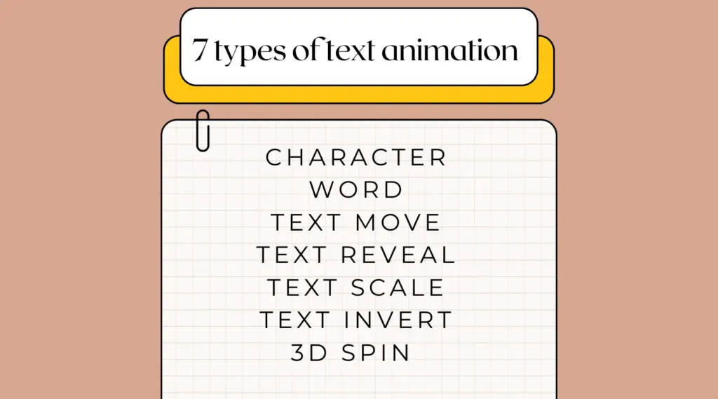
For example, suppose you wanted to apply a simple text animation. In the older version, you could set a character animation for desktop, a text move animation for laptop, a text reveal animation for tablet, and a text scale animation for mobile. However, once you switched to the desktop view, the animation automatically changed to text scale and was applied to all responsive platforms. This limitation made it difficult to create unique animations for different devices, as one setting affected every screen size simultaneously.
Updated Version of Responsive Animation
Now, with the new and improved version, we have completely solved this issue.
You can easily create device-specific animations meaning each platform can have its own distinct motion style. You can add a Text Move animation for tablet, a Text Reveal for mobile, and a Text Scale effect for desktop, all within the same project. Each animation is fully independent, allowing you to fine-tune transitions, timing, and effects for every device view.
Below, we demonstrate how text animations can be made fully responsive across all platforms. This section highlights the steps and features that ensure smooth and adaptive animations on every device.
In short, the upgraded version brings true responsive animation design how your content moves, scales, or reveals on every platform independently. It’s a powerful enhancement that makes your website not just responsive, but intelligently adaptive offering a seamless, visually engaging experience across desktop, laptop, tablet, and mobile devices.
Approach to Responsive Text Animation Across All Platforms
Our approach to responsive design ensures that every website looks and performs perfectly across desktop, laptop, mobile, and tablet devices. We use flexible layouts and adaptive images so that the design automatically adjusts to any screen size.
First, select the text you want to animate. From the left hand side, you will see text animation of Animation Addons.
For text animation, we will use an On scroll trigger animation for 4 types of responsive views. It starts when the user scrolls the page to bring the element into view. It’s commonly used for creating dynamic effects as users move through a page.
We will use Enable on Editor, a feature of Animation Addons that allows you to activate and control animations directly within the editing interface. It gives users real-time feedback and customization without having to preview the website externally.
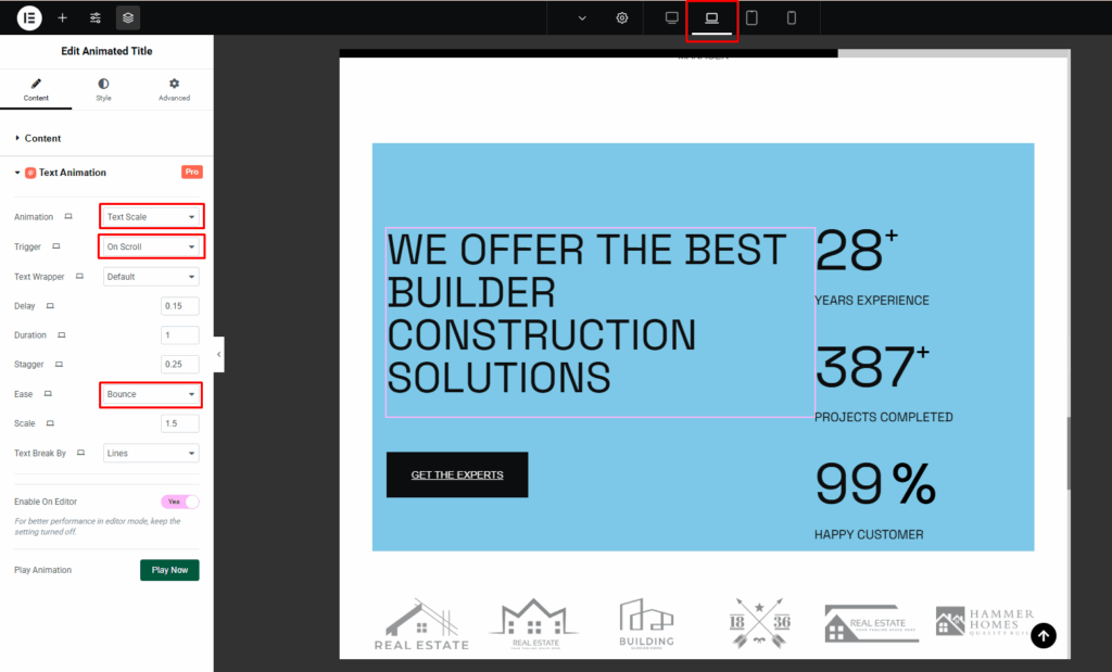
Desktop Version
For the desktop overview, highlight the text you want to animate on your webpage. Choose the animation type for your text. Here, we choose the Word animation and set the trigger to Scroll.

Here, Word animation applies effects to entire words rather than individual letters. This is useful for emphasizing certain words without animating every single letter.
Then, configure the delay, duration, and stagger and set the value to default to control how and when each word appears.
Laptop Version
Choose the specific text you want to animate. Turn on the text scale animation option from your animation settings.
Text Scale means how much the text will grow or shrink (for example, we use 1.5). Text Scale changes the size of the text during the animation. The text can grow larger (zoom in) or shrink (zoom out) to draw attention or create emphasis while maintaining readability.
We use the ease value to bounce. Configure the animation’s delay and duration to control when and how smoothly the text scales on the laptop view.
Tablet Version
For the tablet version (portrait mode), click on the text you want to animate. Turn on the text move animation from the animation settings. Text Move animates the position of text, sliding it in or out from a specific direction. It adds motion to the text’s placement, creating a sense of flow or transition on the page.

Now, select how the text will move whether in the X- axis or Y-axis. You can change the rotation value and transformOrigin to see how much the text will rotate from its position. Here, the rotation value is -80 and the transformOrigin is top center -50.
You can also adjust the delay, duration and stagger to control when the movement starts and how smoothly it plays on tablet view.
Mobile Version
Click on the text you want to animate. For the mobile version, click on the text reveal animation.
Text Reveal gradually uncovers the text and creates the appearance of text emerging smoothly from behind a layer or shape, adding a dramatic entrance effect. Select how the text will appear.

Set the delay, duration and stagger to make the reveal smooth and perfectly timed for mobile screens.
As demonstrated, we have applied different animation effects for text across desktop, laptop, tablet, and mobile devices. Each animation functions smoothly within its respective platform, ensuring a consistent and polished experience. Nothing overlaps or changes across devices, maintaining perfect responsiveness and visual harmony everywhere.
How Do We Ensure Perfect Responsiveness?
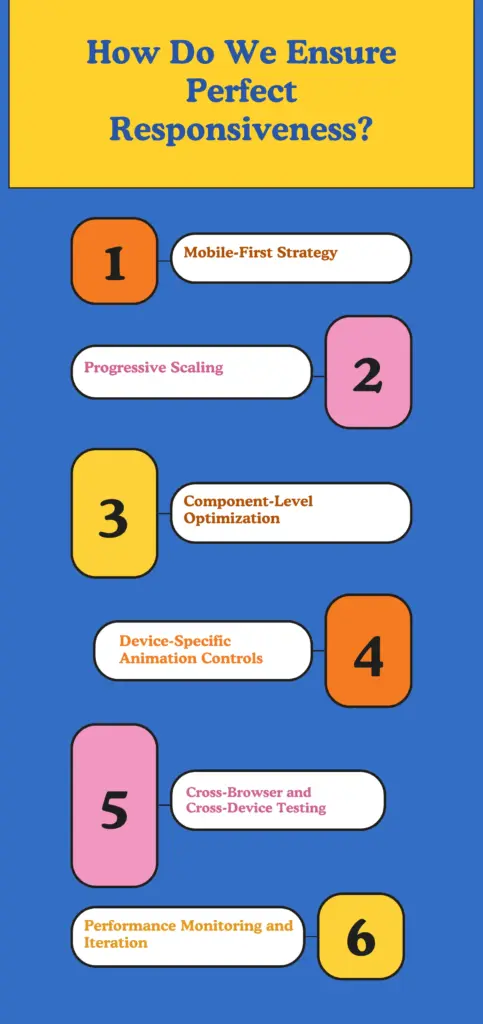
Mobile-First Strategy
We begin with a mobile-first design, prioritizing essential content and features for small screens. This ensures clarity, speed, and usability before scaling the layout for larger devices.
Progressive Scaling
Designs are progressively enhanced for tablet, laptop, and desktop, preserving visual hierarchy and interaction patterns while taking advantage of larger viewports where appropriate.
Component-Level Optimization
Every element including text, images, and animations is optimized for balance and readability. Media assets are sized and compressed; typography and spacing are tuned for legibility across devices.
Device-Specific Animation Controls
Animations are governed by device-aware controls so effects are tailored per platform. Mobile animations are subtle and performance-friendly, while desktop animations can be richer without sacrificing responsiveness.
Cross-Browser & Cross-Device Testing
Rigorous testing on multiple browsers, operating systems, and resolutions ensures consistent behavior. We identify and resolve layout shifts, touch/click issues, and rendering discrepancies.
Performance Monitoring & Iteration
Post-launch, we track user behavior and performance metrics, collect feedback, and iterate. Continuous optimization keeps the site adaptive and aligned with real user needs.
Final Words
Creating a responsive and visually engaging website goes beyond adjusting layouts, it’s about delivering a seamless experience across every platform. With our advanced responsive design system, you can now customize animations for desktop, laptop, tablet, and mobile individually. This flexibility ensures that every element moves, scales, or reveals in a way that perfectly fits each screen size.
No matter where your audience visits from, they’ll experience the same smooth, professional, and captivating design that reflects your brand at its best.

Leave a Reply