 Login
Login
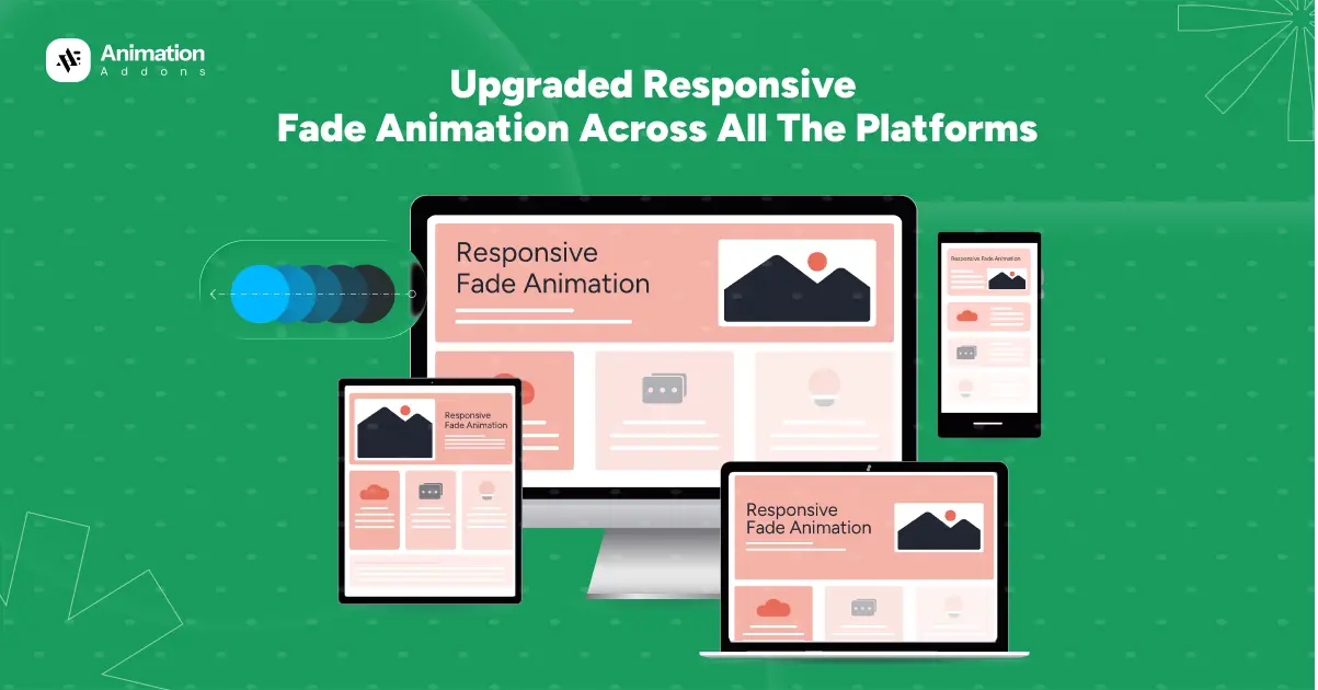
Fade animation is one of the simplest yet most powerful effects used in modern web design. It helps elements appear smoothly, making a website feel cleaner, more polished, and more enjoyable to browse. But as users access websites from different devices like desktops, laptops, tablets, and mobile phones, the same animation doesn’t always behave the way we expect. The older methods often caused fade effects to look inconsistent, load poorly, or even break on certain screens.
That’s why an upgraded responsive fade animation is now essential. This improved approach ensures that fade effects adjust naturally to every device and screen size without losing quality or performance. In this blog, we’ll explore how this upgraded fade animation works, why it’s better, and how it helps create a more consistent and professional user experience across all platforms.
What is Responsive Fade Animation?
Responsive fade animation automatically adapts to different screen sizes and devices. Instead of using one fixed animation for all platforms, responsive fade animation adjusts its timing, smoothness, and behavior so it looks natural whether viewed on a desktop, laptop, tablet, or mobile phone. The main purpose of this technique is to create a visually pleasing transition without overwhelming the user or slowing down the page.
Fade animation works by gradually changing the opacity of an element, making it appear or disappear smoothly. When this effect is made responsive, it becomes flexible enough to handle various resolutions, screen orientations, and performance conditions. This ensures that the animation loads quickly, stays visually consistent, and maintains the same level of smoothness on any device.
Why the Upgrade Was Needed?
The upgrade to responsive fade animation became necessary because the older animation methods were not built to handle today’s wide range of devices and screen sizes. Previously, fade effects were applied in the same way across desktops, laptops, tablets, and mobile phones. While this worked for some devices, it often caused issues on others. For example, animations could appear too slow on large screens, too fast on smaller screens, or may not trigger properly when scrolling. This inconsistency resulted in a broken visual experience for many users.
Another major problem was that older setups didn’t adapt well when switching between different devices. A fade animation designed for desktop might accidentally override animations on mobile, causing elements to behave unpredictably. As modern users expect smooth and polished interactions, these limitations became more noticeable and harder to ignore.
Performance was another concern. Older fade implementations were not optimized for lightweight loading, leading to delays, lag, or choppy animations especially on low-powered devices. With the rise of mobile browsing, this became a critical issue.
The upgrade was needed to ensure animations are consistent, stable, and device-friendly. The new version allows animations to behave independently on each platform, adapt to screen size, and maintain smooth performance everywhere, creating a far better user experience.
Key Features of Upgraded Fade Animation
The upgraded fade animation introduces several improvements that make it more responsive, smoother, and reliable across all devices. One of its main features is adaptive opacity control, where the fade effect automatically adjusts based on screen size and performance capabilities. This ensures the animation feels natural on both large and small screens.
Another important feature is device-based behavior, which allows each platform like desktop, laptop, tablet, and mobile to maintain its own fade settings without affecting others. This prevents animation conflicts and keeps the design consistent everywhere.
The upgraded version is also built with lightweight and performance-friendly techniques, using optimized CSS transitions or GSAP to ensure smooth animations without slowing down the page. Additionally, flexible timing and easing options give more control over how fast or slow the fade appears, allowing designers to create more polished and engaging visual effects.
Responsive Fade Animation Control Across All Devices [Updated Version]
Old Version of Responsive Fade Animation
In the old version, responsive fade animation worked, but it had several limitations that made it difficult to maintain consistency across devices. Each platform desktop, laptop, tablet, and mobile was given a different fade effect or direction. For example, desktop might use a left-side reveal, laptops a right-side reveal, tablets a bottom reveal, and mobiles a scale-based fade. While this allowed for variety, the animations were not fully isolated from each other.
In the older version of fade animation system, each device had its own unique animation direction and easing style. On desktop, we use fade animations from the top using Power2.out for a smooth finish. On laptop, the fade came from the bottom with a bounce ease to add a lively effect. For tablet, the animation faded in from the left using Back easing and on mobile, the fade came from the right with an elastic ease for a stretchy, dynamic entrance.
However, the main limitation with this older version was that animation values weren’t isolated per device. This meant that if you applied a fade animation for mobile, that same configuration would automatically override the animations on desktop, laptop, and tablet. Instead of each platform maintaining its own effect, the settings for one device carried over to all others. As a result, the fade animations became inconsistent and behaved the same across every screen, even when unique animations were intended.
Additionally, the old version wasn’t optimized for performance. Fade effects performed differently depending on screen size, and some animations appeared too slow, too fast, or didn’t trigger properly. This became more noticeable as users began accessing websites from a wider range of devices and resolutions.
New Version of Responsive Fade Animation
The new version brings a much more refined, stable, and fully responsive approach. Instead of using different reveal styles for each device, all platforms like desktop, laptop, tablet, and mobile use the same fade animation. This ensures a uniform visual experience and eliminates conflicts caused by mixed effects.
The upgraded system allows each device to maintain its own fade settings without affecting others. Whether adjusting the duration, easing, or trigger behavior, these settings stay locked to the specific platform you are working on. The animation is triggered using scroll-based activation, which works smoothly across all screen sizes and ensures elements fade in at the right moment.
This new approach also enhances performance. The fade effect is lightweight, smooth, and optimized for both high-powered desktops and lower-powered mobile devices. Nothing overlaps, nothing breaks, and all animations remain stable.
In short, the updated version brings consistency, control, and better performance resulting in a clean, professional fade animation across all devices.
Approach to Responsive Fade Animation Across All Platforms
Our approach to responsive fade animation is to keep the effect simple, smooth, and consistent on every device while still allowing small tweaks for each screen size. We use the same base fade animation everywhere, but adjust timing and behavior so it feels natural on desktop, laptop, tablet, and mobile.
First, select the image you want to animate. Under the Advanced tab, click on the Animation section. Here, you will find 3 types of animations – Fade, 3D and Custom from where you will select fade animation. This means the element will use a fade effect.
Now, select the trigger to OnScroll, which means the animation will start when the user scrolls and the element comes into view. Keep the delay to 0.15s and duration to 1.2s so that the animation waits 0.15 seconds before starting after it’s triggered and the fade animation lasts 1.2 seconds.
We also use Enable on Editor, a feature that allows you to preview and adjust animations directly inside the editing interface. This gives you real-time control without having to switch between editor and preview mode.
Desktop
For the desktop version, we use the fade animation with the element fading in from the top. This creates a smooth downward entrance that feels clean and professional on larger screens. To enhance the motion, we apply the bounce easing, which adds a soft, playful bounce at the end of the animation. This makes the fade-in feel more dynamic without being distracting.
Laptop
For the laptop version, we use the Fade animation with the element fading in from the bottom. This creates a smooth upward entrance that works well with medium-sized screens. To make the motion more lively, we apply the elastic easing, which gives the animation a stretchy, elastic-like effect as it settles into place.
Tablet
For the tablet version, we use the Fade animation with the element fading in from the left. This creates a smooth horizontal entrance that feels natural on tablet screens, especially in portrait mode. To keep the movement clean and controlled, we apply the Power2.out easing, which starts a bit faster and slows down gently at the end. This makes the animation feel polished without overwhelming the smaller layout.
Mobile
For the mobile version, we use the Fade animation with the element fading in from the right. This creates a smooth side entrance that feels natural on smaller screens and aligns well with mobile scrolling behavior. To give the animation a calm, cinematic feel, we apply the SlowMo easing. This easing slows down the motion at key points, making the fade-in look soft and visually pleasing without rushing the effect.
As shown, we have used different fade animations for desktop, laptop, tablet, and mobile views. Each effect runs smoothly on its specific device, delivering a clean and consistent visual experience. No settings overlap or interfere with one another, ensuring full responsiveness and maintaining perfect design harmony across all platforms.
Best Practices for Implementing Responsive Fade Animation
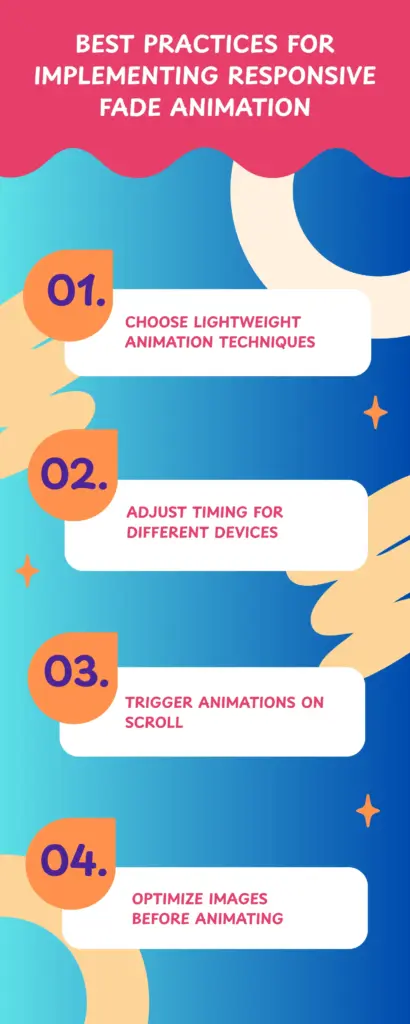
1. Choose Lightweight Animation Techniques
For smooth performance across all devices, use lightweight animation methods such as CSS opacity transitions or GSAP’s optimized fade effects. These techniques minimize browser load and keep animations running smoothly, even on slower mobile devices. Avoid heavy animations that trigger layout changes, as they can cause lag or jitter.
2. Adjust Timing for Different Devices
Different screen sizes and user behaviors require different animation speeds. Longer fade durations work well on desktop, while shorter durations feel more natural on mobile. Adjusting timing ensures that the fade animation feels balanced, not too slow or too fast, on each platform.
3. Trigger Animations on Scroll
Using scroll-based triggers ensures elements fade in only when they enter the viewport. This not only improves performance but also creates a more interactive and engaging experience. It prevents unnecessary animations from running off-screen and keeps the page more responsive.
4. Optimize Images Before Animating
A fade animation will only look smooth if the optimize image itself loads quickly. Use modern formats like WebP, AVIF, or compressed JPEGs to reduce file size. Responsive images also ensure the right resolution is loaded for each device.
Final Words
Upgraded responsive fade animation brings a modern, smooth, and device-friendly approach to web interactions. By tailoring fade effects for desktops, laptops, tablets, and mobile devices, you ensure that every user enjoys a seamless and visually consistent experience. The updated method solves previous issues where animations overlapped or behaved unpredictably across platforms.
This approach not only enhances the design but also improves accessibility, user engagement, and overall professionalism. As web design continues to evolve, adopting responsive fade animation is a smart step toward creating interactive, elegant, and high-impact websites that perform reliably on every device.

Leave a Reply