 Login
Login
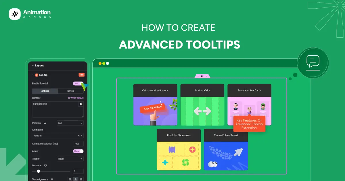
Tooltips play a crucial role in improving user experience by delivering helpful information without cluttering the interface. In WordPress, basic tooltips are easy to implement, but modern websites demand more than static hover text. Advanced tooltips combine smooth animations, rich content, and smart positioning to create interactive, engaging, and intuitive user guidance.
With tools like Animation Addons, you can go beyond default tooltip behavior and create visually appealing, performance-optimized tooltips that respond naturally to user interactions. In this guide, you’ll learn how to design and implement advanced tooltips in WordPress while maintaining speed, accessibility, and a polished user experience.
What Is an Advanced Tooltip?
An advanced tooltip is an enhanced version of the traditional tooltip that goes beyond simple text displayed on hover. Instead of showing plain, static information, advanced tooltips support rich content such as images, icons, formatted split text, buttons, and even interactive elements. They often include smooth and cool animations, dynamic positioning, smart triggers (hover, click, scroll, or focus), and responsive behavior for mobile devices.
Advanced tooltips can follow the cursor, adjust automatically to screen edges, and integrate with animation libraries like GSAP for fluid transitions. In WordPress, especially when using tools like Animation Addons, advanced tooltips help create modern, engaging interfaces that improve usability while maintaining performance and accessibility standards.
Use Cases of Advanced Tooltips in Modern Websites
Advanced tooltips are widely used in modern web design to deliver contextual information without interrupting the user journey. When implemented correctly, they improve usability, reduce cognitive load, and create engaging micro-interactions.
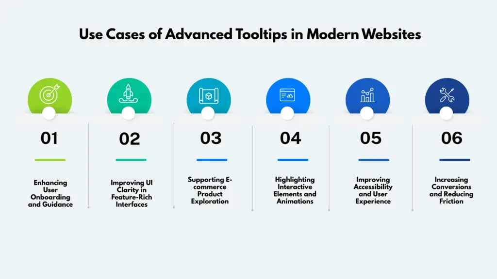
Enhancing User Onboarding and Guidance
Advanced tooltips are highly effective for onboarding new users. Instead of long tutorials or pop-ups, tooltips can guide users step by step by interactive buttons, features, or workflows as they interact with the interface. Animated transitions make the guidance feel natural and less intrusive, helping users learn faster.
Improving UI Clarity in Feature-Rich Interfaces
Websites with complex dashboards, admin panels, or data-heavy layouts benefit greatly from advanced tooltips. Icons, charts, and controls can remain visually clean while tooltips reveal detailed explanations, usage tips, or additional data only when needed.
Supporting E-commerce Product Exploration
In e-commerce websites, advanced tooltips can display product details such as size guides, material information, shipping notes, or discount explanations. Rich content like image animation or icons inside tooltips helps users make informed decisions without leaving the product page.
Highlighting Interactive Elements and Animations
For animation-driven websites, advanced tooltips help explain interactive elements that may not be immediately obvious. Hover-based or cursor-follow tooltips can describe animations, effects, or triggers, improving user engagement while maintaining a clean visual design.
Improving Accessibility and User Experience
Advanced tooltips can enhance accessibility when implemented with proper focus states, keyboard navigation, and screen-reader support. They provide contextual help for form fields, error messages, and instructions, making the website more inclusive and user-friendly.
Increasing Conversions and Reducing Friction
By answering user questions at the right moment, advanced tooltips reduce hesitation and friction. Whether explaining pricing, form inputs, or feature benefits, well-timed tooltips guide users toward confident actions, ultimately improving conversion rates and overall user satisfaction.
How to Create Advanced Tooltip Using Animation Addons
Animation Addons makes it easy to add advanced and interactive tooltips to any element on your Elementor website without writing code. With this feature, you can display helpful information creating smooth animations, customizable positions, and flexible trigger options like hover or click. Using Animation Addons, you can create engaging user experiences while keeping your interface clean and informative.
Step 1: Enable Advanced Tooltip
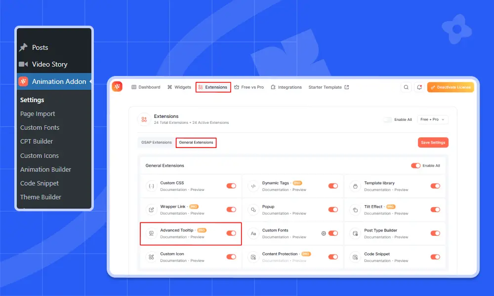
First, choose the widget or element where you want to display the tooltip.
- Click on the element.
- Go to the Advanced tab in the page builder.
- Find Advanced Tooltip.
- Toggle the switch to Enable.
Once enabled, the tooltip feature becomes active for that specific element.
You’ll notice two main sections:
- Settings
- Styles
Let’s start with Settings.
Step 2: Configure Tooltip Settings
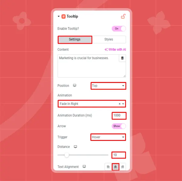
The Settings section controls how your tooltip behaves and appears on your website. Start with the Content field, where you can enter the text you want to display inside the tooltip. For example, you might add a message like “Marketing is crucial for businesses.” This text will appear whenever users interact with the selected element.
Next, choose the Position of the tooltip. You can display it at the Top, Bottom, Left, or Right of the element. For instance, selecting Top will make the tooltip appear from above the element when triggered.
After that, select an Animation effect to control how the tooltip enters the screen. Options include Fading, Zooming, Bouncing, Sliding, Rotating, Attention Seekers, Light Speed, and Specials. If you choose Fade In Right, the tooltip will smoothly appear from the right side.
You can also adjust the Animation Duration (ms) to control the speed of the effect. For example, setting it to 1000 milliseconds creates a slower, smoother transition, while lower values make it appear faster. The Arrow option allows you to enable or disable the small pointer that visually connects the tooltip to the element as most users keep it enabled for better clarity.
The Trigger setting determines how the tooltip is activated. Choosing Hover will display the tooltip when users move their cursor over the element, while Click requires users to click on it. For better mobile compatibility, the Click option is often recommended. The Distance setting controls how far the tooltip appears from the element; for example, setting it to 20 adds more spacing between them. Finally, use the Text Alignment option to align the tooltip content to the left, center, or right, depending on your design preference.
Step 3: Customize Tooltip Style & Appearance
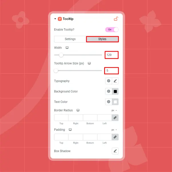
After configuring the behavior settings, move to the Styles tab to design the visual appearance of your tooltip. This section allows you to fully customize how the tooltip looks so it aligns perfectly with your website’s branding and layout. Start by setting the Width of the tooltip box, for example, 120px works well for short content, but you can adjust it depending on how much text you are displaying. Next, modify the Tooltip Arrow Size, such as 5px for a subtle and clean pointer effect.
In the Typography section, you can personalize the text style by choosing your preferred font family (like Nunito), adjusting the font size (for example, 14px), and selecting a suitable font weight (such as 500 – Medium). To enhance readability and visual appeal, select an appropriate Background Color, such as black for strong contrast, and pair it with a clear Text Color, like white.
You can also refine the design using Border Radius to create softer, rounded corners for a modern look. Adjust the Padding to control the spacing between the text and the edges of the tooltip box, ensuring the content doesn’t feel cramped. Finally, apply a Box Shadow by setting its color, horizontal and vertical position, blur, spread, and placement to create a subtle floating effect that adds depth and professionalism to your tooltip design.
Final Result
Once everything is configured:
- Update or Publish your page.
- Test the tooltip on both desktop and mobile.
- Adjust animation speed, spacing, or styling if needed.
With Animation Addons, you can create visually appealing, fully customizable advanced tooltips without writing a single line of code. Just enable, customize, and style according to your user design needs.
Common Mistakes to Avoid When Using Tooltips
Tooltips can greatly enhance user experience, but when implemented incorrectly, they can cause confusion, frustration, and even accessibility issues. Avoiding common mistakes ensures that tooltips remain helpful rather than distracting.
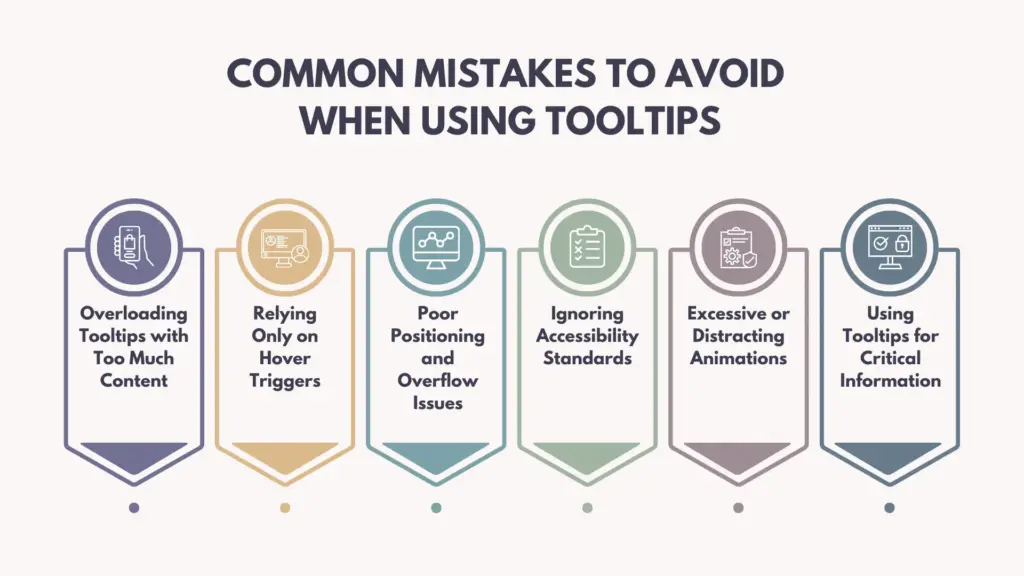
Overloading Tooltips with Too Much Content
One of the most common mistakes is placing excessive information inside a tooltip. Tooltips are meant to provide brief, contextual guidance not long explanations or paragraphs of text. Overloading them with complex details can overwhelm users and defeat their purpose. If the content is lengthy, consider using a modal or expandable section instead.
Relying Only on Hover Triggers
Many websites make the mistake of triggering tooltips only on hover. This approach excludes mobile users and those navigating via keyboard. Advanced tooltips should support click, focus, or touch interactions to ensure accessibility across all devices.
Poor Positioning and Overflow Issues
Improper positioning can cause tooltips to be cut off near screen edges or overlap important content. Without smart positioning logic, tooltips may appear outside the viewport, especially on smaller screens. Always ensure tooltips automatically adjust their placement based on available space.
Ignoring Accessibility Standards
Tooltips that lack keyboard support, ARIA attributes, or sufficient color contrast create barriers for users with disabilities. Failing to make tooltips screen-reader friendly can result in critical information being inaccessible.
Excessive or Distracting Animations
While animations enhance interactivity, overly complex or slow animations can reduce usability. Tooltips should appear quickly and smoothly. Avoid dramatic motion effects that distract users from their primary task.
Using Tooltips for Critical Information
Tooltips should support content, not replace essential instructions. Important information, warnings, or required form details should always be visible on the page rather than hidden inside a tooltip.
Final Thoughts
Advanced tooltips are a powerful UI element that can significantly enhance user experience when implemented thoughtfully. They help deliver contextual information, keep interfaces clean, and guide users without disrupting their workflow.
However, it’s essential to avoid common mistakes such as overloading content, relying only on hover interactions, or ignoring accessibility standards. With tools like Animation Addons, creating well-optimized and user-friendly tooltips in WordPress becomes easier and more efficient. When designed with clarity, performance, and inclusivity in mind, advanced tooltips can greatly improve engagement, usability, and overall website quality.
FAQs
1. What is the Advanced Tooltip Extension used for?
The Advanced Tooltip Extension is used to display small, interactive popups that appear when users hover over or click on elements. It allows you to show helpful information without cluttering your design. You can use it on buttons, icons, forms, images, and more to improve clarity and guide user actions.
2. Are advanced tooltips suitable for mobile devices?
Yes, when implemented correctly. Advanced tooltips should use touch-friendly triggers like tap or click instead of relying only on hover. Responsive positioning ensures they display properly on all screen sizes.
3. Do tooltips affect my website’s loading speed?
No, the Advanced Tooltip Extension is built to be lightweight and performance-friendly. It only loads the necessary scripts and styles, so there’s minimal impact on page load times. You can safely use multiple tooltips throughout your site without worrying about speed issues.
4. What triggers and animations can I choose from?
You can choose from two main triggers like hover and click and pair them with a wide range of entrance animations like fade, slide, bounce, zoom, and more. Each tooltip’s behavior and appearance is fully customizable, so it matches your site’s motion design and usability goals.
5. When should I avoid using tooltips on a website?
Tooltips should be avoided for essential instructions, critical warnings, or long content. If the information is crucial for completing a task, it should be visible on the page rather than hidden behind a tooltip.
Leave a Reply