The Button widget offers endless customization options for your web page’s buttons. This widget is perfect for creating attractive, action-driven buttons that increase your website’s conversion rate.
Choose from Default, Square, Underline, Mask, Oval, Circle, and Ellipse button styles. Each style is designed to fit seamlessly into different layouts, providing a unique touch to your design.
Advanced Hover Effects
Enhance user experience with smooth hover effects like Divided, Cross, Cropping, Rollover, and Parallel Border. These animations create an engaging and dynamic feel when users interact with your buttons.
Fully Customizable Button Text
Modify the button text to align with your brand messaging and call-to-action. Whether it’s a simple label or a compelling CTA, you have full control over how your button communicates with visitors.
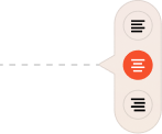
Icon Support
Add icons alongside your button text to make your design more intuitive and visually engaging. Choose from a vast icon library to match your website’s theme and purpose.
Flexible Icon Positioning
Customize icon placement by positioning it before or after the button text. This allows for better alignment and enhances readability based on your design preference.
Direction Control and Text Placement
Position your text and icons either beside each other or with the icon placed below the text. This flexibility ensures that your buttons adapt perfectly to different design needs.
Adjustable Icon Spacing
Fine-tune the spacing between the text and the icon to achieve the ideal balance. With precise spacing control, you can create a clean and well-structured button design.
Easy Link Integration
Easily add links to your buttons, directing users to internal pages, external websites, or custom URLs. This feature ensures smooth navigation and boosts conversions with well-placed CTAs.
Ready to take your designs further? Animation Addons gives you everything you need to design websites that stand out with clean, professional animations.
 Login
Login


