 Login
Login


 Cupon Code Applied
In today’s digital world, websites are more than just static pages—they’re immersive experiences. One of the most powerful tools for enhancing this experience is animation. Whether it’s a subtle text reveal or a dynamic image slider, animation can breathe life into a web page, making it not only visually appealing but also more engaging and interactive. Animation captures attention, guides the user’s focus, and creates a memorable browsing experience that keeps visitors coming back.
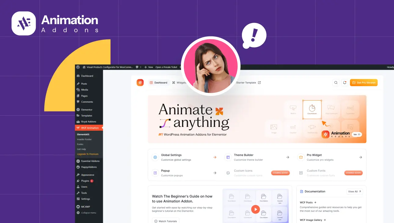
Elementor, one of the most popular WordPress page builders, has made it incredibly easy for users to add animation to their websites through its drag-and-drop interface. With its built-in animation options and seamless integration with additional plugins, Elementor empowers even non-technical users to build professional-looking sites.
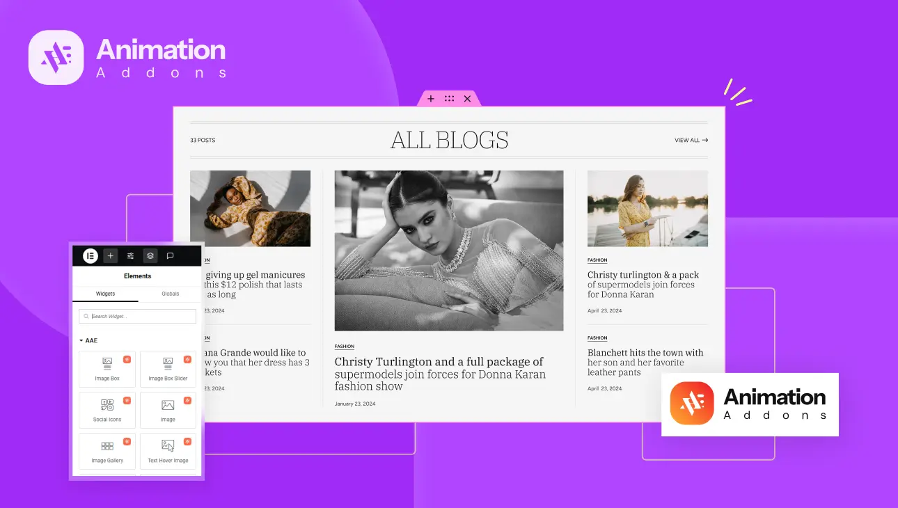
Among these enhancements is the Animation Addons plugin for Elementor—a toolkit designed to extend Elementor’s animation capabilities. With this plugin, users can animate text, images, icons, sliders, and much more. The goal is to provide greater visual control and interactivity, allowing users to craft highly engaging, custom-designed pages.
But with great power comes great responsibility. While animations can improve a website’s appeal, using them incorrectly can have the opposite effect. Misapplied or excessive animation can clutter your design, slow down your site, and confuse your visitors. This guide aims to shed light on the most common mistakes users make when using Animation Addons for Elementor and how to avoid them. By understanding these pitfalls, you’ll be able to use animation strategically and professionally, ensuring your site delivers a polished, user-friendly experience.
Misunderstanding the Purpose of Animation
One of the most frequent and subtle mistakes made by designers using animation is treating it purely as decoration rather than a tool with a purpose. Animation is not just about making things move—it’s about making things make sense. Its real value lies in its ability to convey meaning, direct attention, and enhance usability.
Using animation without intention can easily backfire. Imagine landing on a website where every heading spins, every image bounces, and every button pulses. Instead of engaging, the animation becomes a distraction. For example, applying a 3D Spin effect to a section title might seem fun, but if the goal is to deliver a message clearly and quickly, a more subtle Text Reveal or Fade-In would be more appropriate. Animation should never compete with the content—it should support it.
The solution? Always ask yourself why you’re animating something. Is it to highlight, emphasize, guide, or simply entertain? Animation should have a clear functional role in your design. When aligned with your content and purpose, it strengthens your site’s impact instead of diluting it.
Overusing Animation Across the Page
While animation can enhance a web page, overloading your site with motion can create chaos. One of the most common mistakes users make is animating every element on a page—text headers, images, sliders, icons, testimonials, accordions—all moving as the user scrolls. What starts out as a fun experience quickly turns into a visual overload.
When every element is animated, it becomes difficult for the user to focus. The viewer’s attention is pulled in multiple directions at once, which can lead to confusion and frustration. Worse still, performance often takes a hit. Over-animating your page increases the amount of browser rendering required, which slows down load times, especially on older devices or slower connections.
Consider a scenario where your homepage includes a bouncing Social Icons widget, a zooming Testimonial Slider, a scrolling Accordion, and a pulsing call-to-action button. All of these animated at once can be overwhelming. Visitors might be unable to process the content because their attention is constantly interrupted by moving elements.
The fix is simple: moderation. Use animation to highlight key areas that deserve attention, like your hero section, featured products, or important calls to action. By keeping most of your page static and reserving animation for high-impact moments, you maintain focus and clarity. This selective use of animation not only improves usability but also makes each animation feel more meaningful.
Ignoring Mobile Responsiveness
In the mobile-first world we live in, it’s not enough for your site to look good on a desktop. More than half of global web traffic now comes from mobile devices, and animations that work flawlessly on large screens can fail miserably on smaller ones.
One of the biggest mistakes users make with Animation Addons for Elementor is not optimizing animations for mobile and tablet devices. Some effects—especially scroll-based or complex reveal animations—require more processing power and can become choppy or unresponsive on mobile. Others may not display properly at all. Users on slower mobile data networks may experience delayed animations, affecting both perception and functionality.
For example, using a heavy image animation on scroll (like a high-resolution image reveal with elastic easing) might look great on your laptop but could result in lag or a jumpy experience on mobile. Additionally, certain interactions, like hover animations, don’t even function on touchscreens.
To avoid this, take advantage of the built-in responsive controls in the Animation Addons plugin. Use breakpoints to enable, disable, or adjust animations based on device type. You can tone down animation intensity for mobile or eliminate certain effects entirely for better performance. Always preview and test your site across devices to ensure animations contribute positively to the mobile experience.
Mobile responsiveness isn’t just a bonus—it’s a necessity. Ignoring it can drive users away from your site and damage your credibility.
Using Inconsistent Animation Styles
Consistency is one of the pillars of good design. When it comes to animation, the same rule applies. A site that uses multiple animation styles without harmony feels chaotic and unprofessional. This is a mistake many users fall into—mixing bouncy entrances with rotating sliders, pulsing buttons, and floating images, all on one page.
Let’s say your Brand Slider rotates in from the left, your Image Box zooms in, and your call-to-action button pulses continuously. These styles might work well individually, but together they clash. Animation inconsistency creates a fragmented experience that distracts instead of delights.
The key to solving this issue lies in setting an animation style guide for your website. Decide early on whether your site’s tone is elegant, playful, modern, or minimal. From there, choose a limited set of animation styles that fit that tone—maybe you stick to smooth fades and reveals, or perhaps gentle slide-ins and minimal scaling effects. Define the duration, speed, and trigger behavior (on scroll, on hover, etc.) and apply it uniformly.
Animation Addons offers a wide range of options, but that doesn’t mean you should use them all at once. Pick a few that reinforce your site’s identity and apply them consistently. This creates a polished, cohesive experience for your visitors.
Neglecting Performance Optimization
Animations don’t live in a vacuum—they rely on other resources like images, scripts, and browser processing power. If these aren’t optimized, your beautifully animated website could become painfully slow to load and navigate. Performance issues not only frustrate users but also negatively impact your SEO rankings and overall site health.
One of the major culprits is uncompressed media. Using high-resolution images in combination with reveal or scale animations can put a heavy load on the browser. Throw in multiple auto-play sliders and scroll-triggered animations, and you’ve got a recipe for sluggish performance.
Take, for example, a homepage featuring several large, high-resolution image boxes, each with a scale reveal effect and staggered entrance. Combine that with an autoplaying testimonial slider, and visitors may be staring at a loading screen longer than your actual content.
To avoid this, start with the basics: compress your images using tools like TinyPNG or WebP. Choose the appropriate resolution for each image—don’t upload a 3000px-wide image if it only needs to display at 600px. Limit the number of simultaneous animations and use lazy load features for images and sliders. Animation Addons provides control options for timing and sequencing—use them to delay animations and reduce the load at page start.
Also, regularly test your site using tools like Google PageSpeed Insights or GTmetrix. These will help you pinpoint performance bottlenecks and provide actionable suggestions. Remember, smooth performance enhances the effectiveness of your animations and contributes to a better user experience overall.
Forgetting Accessibility and Usability
Animation isn’t just a visual design choice—it affects how people interact with your website. When implemented carelessly, animations can become barriers for users with accessibility needs. This is one of the most overlooked aspects of animated web design.
Consider users with motion sensitivity. Excessive motion, especially parallax or fast-moving elements, can trigger discomfort or even physical symptoms like dizziness. Then there are users who rely on screen readers or keyboard navigation. Hover-triggered animations or motion-based reveals that don’t offer fallback content can make important information inaccessible.
For instance, if your site uses a hover-triggered text reveal on a product description or a motion-based slider that doesn’t include pause controls, you’re creating usability challenges for people who can’t access that content or control the animation.
To address this, use animations that degrade gracefully—meaning your content remains accessible even if the animation fails or is disabled. Provide alternatives when possible. For example, ensure that all key information is visible or accessible without needing to hover. For carousels and sliders, offer pause, stop, or manual navigation buttons.
Following WCAG (Web Content Accessibility Guidelines) is crucial. These guidelines recommend minimizing motion or allowing users to turn it off if needed. Animation Addons provides responsive and conditional control options—use them to respect user preferences and improve inclusivity.
Accessibility isn’t just about checking boxes. It’s about making your site usable for everyone, regardless of ability. When your animations support usability rather than hinder it, you’re designing with empathy and intention.
Overcomplicating Navigation with Animated Elements
Navigation is one of the most important aspects of any website. It should be intuitive, fast, and unobtrusive. One of the mistakes users make is adding animations that slow down or complicate navigation. While it may be tempting to add stylish slide-ins, bounces, or transitions to menus and buttons, these animations can delay interactions and frustrate users.
Imagine clicking a menu button, only to wait three seconds for a panel to slide into view, or hovering over a call-to-action button that pulses before becoming clickable. While it might look slick the first time, repeated delays like this can make the user feel like the website is working against them.
The solution is to treat navigational animations with restraint. Animations should enhance clarity and feedback, not slow down or obstruct access. Use quick fades, subtle slides, or instant transitions. Animation Addons provides fast and responsive animation settings—keep navigation elements snappy and precise.
In short, always prioritize usability over flair when it comes to your navigation. Visitors should never have to wait for a menu to animate just to find what they’re looking for.
Not Testing Across Browsers and Devices
Another commonly overlooked mistake is assuming that animations will work uniformly across all browsers and devices. The reality is, different browsers interpret CSS and JavaScript animations in slightly different ways, and what works in Chrome may not look the same in Safari or Firefox. On mobile, this disparity can be even more pronounced.
Imagine you design a beautiful image reveal using scroll-based animation in Chrome. It works perfectly. But when you test the same animation on mobile Safari, it stutters or fails to trigger altogether. Without thorough testing, you might never know this is happening—and your visitors suffer as a result.
The fix is straightforward: always test your site across multiple browsers—Chrome, Firefox, Safari, and Edge. Don’t forget to check both Android and iOS devices, as mobile rendering engines behave differently from their desktop counterparts. Use browser developer tools to simulate devices and debug issues.
Also, be prepared with fallback styles. If a scroll animation fails, the element should still appear clearly and readably. Animation Addons allows for control over breakpoints and simplified motion settings—take advantage of those features to ensure consistent cross-browser performance.
Ignoring Scroll-Based Timing and Placement
Scroll-based animations can be powerful, but only when timed correctly. One of the more technical mistakes users make is misplacing animation triggers. If an animation is set to fire too early, it might activate before the user sees the element. Too late, and it might be missed altogether.
For example, if your Image Box reveal animation is set to trigger when it’s still below the viewport, it may be complete before the user scrolls to that section. Conversely, if it’s set to “Bottom Bottom,” it may activate only after the user has scrolled past the element, rendering it ineffective.
The key to solving this is understanding scroll triggers and adjusting them with precision. Animation Addons gives you scroll trigger options like “Top Center” or “Center Bottom”—use these to control exactly when animations fire. Combine them with delay and stagger settings to orchestrate smoother, more controlled entrances that enhance user engagement without surprises.
Fine-tuning scroll animation isn’t about being flashy—it’s about timing your message so it lands exactly when it needs to.
Conclusion
Animations can make your website feel alive—but only when used thoughtfully. As we’ve explored, there are many common mistakes that can undermine the effectiveness of Animation Addons for Elementor: overusing effects, mismatched styles, ignoring mobile responsiveness, forgetting accessibility, neglecting performance, complicating navigation, and failing to test across platforms.
The key takeaway is balance. Animation should complement your content, not overpower it. It should be used to draw attention, tell stories, and improve user flow, not just to impress.
Animation Addons is a powerful plugin that gives you immense creative control. But with that power comes responsibility. Take the time to understand each setting, test on real devices, and think critically about how each animation serves your site’s purpose.


