 Login
Login
In today’s digital landscape, the expectations for websites have evolved dramatically. It’s no longer enough for a site to simply exist — it needs to feel alive. Users expect more than static pages; they want interactive, engaging experiences that adapt seamlessly to whatever device they’re using. Whether it’s a smartphone, tablet, or widescreen monitor, modern websites must be responsive by design. Responsiveness ensures that the content remains accessible, visually appealing, and functional across all screen sizes. But responsiveness alone isn’t the full picture. A truly modern website must also be visually dynamic. Animations and transitions play a crucial role in guiding user attention, enhancing storytelling, and making interactions feel more natural.
This is where Elementor comes into the spotlight. As one of the most powerful and user-friendly WordPress page builders, Elementor empowers designers with intuitive drag-and-drop tools that simplify layout creation while still offering deep customization. It bridges the gap between professional design and user accessibility. Yet, even with its robust toolkit, there’s always room for enhancements — especially in the realm of motion and interactivity.
Enter Animation Addons for Elementor. These addons extend the core capabilities of Elementor by introducing finely-tuned animations, interactive widgets, and performance-conscious enhancements that take design possibilities to the next level. They’re not just bells and whistles — they serve as essential tools for creating immersive experiences that hold user attention and drive engagement.
This guide is crafted for web designers, developers, and creators who want to build responsive, animated pages using Elementor enhanced with Animation Addons. We’ll walk through the entire process — from understanding the tools to final publication — offering insights and techniques to help you get the most out of this dynamic combination. Whether you’re creating a personal blog, an online store, or a portfolio, this guide will help you deliver stunning pages that look and feel great on every screen.
Understanding the Fundamentals
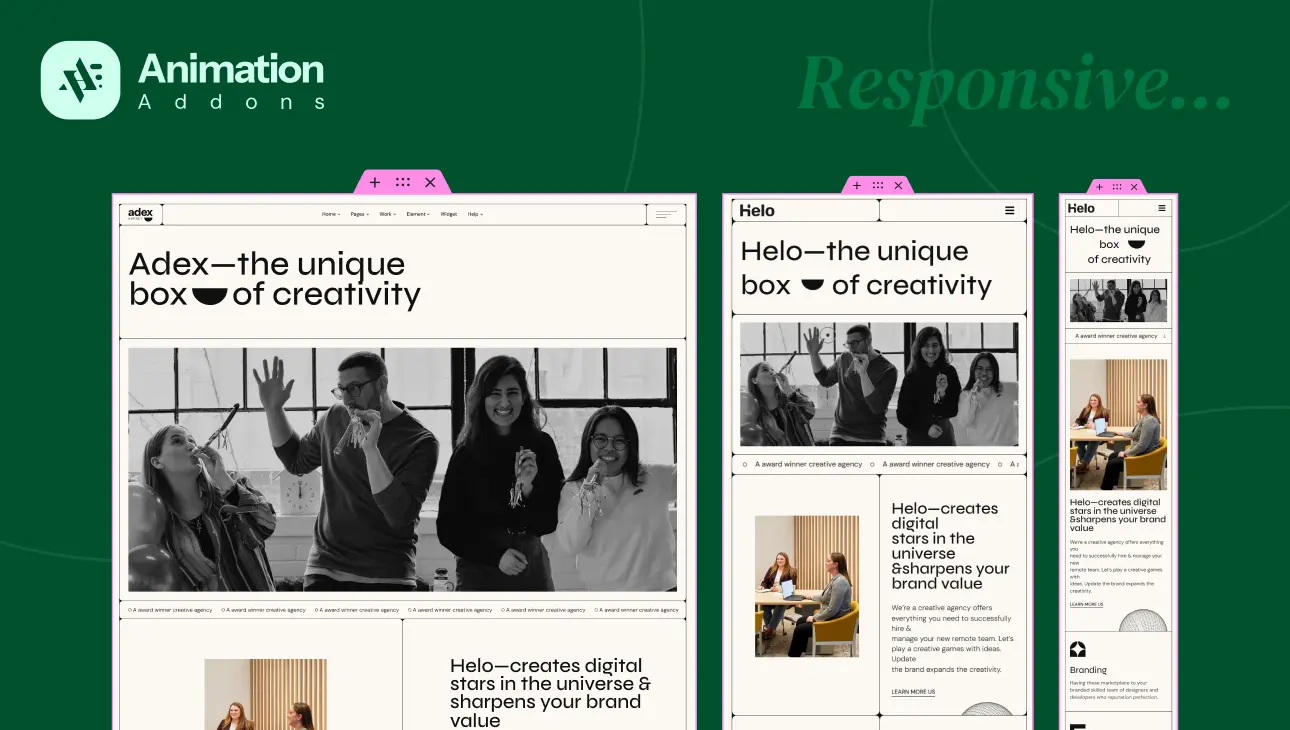
To fully grasp how Animation Addons elevate page design, it’s essential to understand the foundational tool: Elementor. At its core, Elementor is a visual, drag-and-drop builder for WordPress. It replaces the traditional need for coding layouts from scratch with an intuitive interface. Users can build everything from headers and footers to complex landing pages, simply by dragging widgets into place and configuring them using on-screen controls. But Elementor does more than simplify design — it makes responsive design accessible. With built-in tools that let you switch between device views, adjust column widths, set spacing, and even hide elements per device, Elementor ensures your layouts adapt perfectly to any screen.
Now, while Elementor offers a solid base for creating visually pleasing pages, Animation Addons introduce an extra layer of customization. These addons aren’t a standalone plugin but rather an enhancement that plugs into Elementor’s ecosystem. Their core purpose is to provide you with advanced animation tools and interactive widgets that would otherwise be difficult to implement without custom code. With them, you can create scroll-based effects, hover animations, dynamic text movements, and more — all without compromising your page speed or SEO.
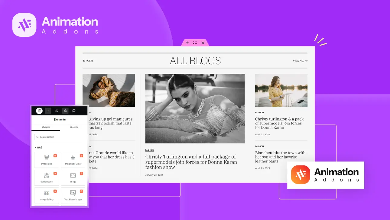
The true value of Animation Addons lies in their curated collection of widgets. From the Image Box Widget, which pairs images with animated headings and descriptions, to the Animated Text Widget, which offers dynamic headline animations like text reveal or 3D spin, the options are both versatile and visually compelling. You also get the Social Icons Widget with creative hover effects, Testimonial Sliders for client feedback, and Brand Sliders that bring logos and texts to life with fluid transitions. All these tools are designed with responsiveness in mind, meaning you can animate thoughtfully across devices without sacrificing usability. With this understanding, we can now dive into the practical steps of building a responsive, animated page.
Preparing Your Workspace
Before you begin designing, it’s crucial to set up a solid and responsive-friendly environment. First, install WordPress on your domain or local server. Choose a lightweight, responsive theme that works well with Elementor — themes like Hello Elementor, Astra, or GeneratePress are excellent starting points as they provide a clean foundation and compatibility with most plugins.
Next, install the Elementor plugin from the WordPress repository. If you’re planning to access advanced features or templates, you might also consider upgrading to Elementor Pro, but the Animation Addons work well with the free version, too. After Elementor is installed and activated, it’s time to add the Animation Addons plugin. Depending on how the plugin is distributed, you may install it directly through the plugin manager or upload a ZIP file manually. Once activated, you’ll notice several new widgets and options in your Elementor interface.
To ensure your designs are responsive from the start, it’s helpful to have a few additional tools ready. The responsive preview modes within Elementor allow you to view and tweak designs across desktop, tablet, and mobile layouts. However, it’s also wise to inspect your pages using browser developer tools, which offer more precise control and let you test a wider range of screen sizes. Keeping a few physical devices nearby — like a tablet or smartphone — is also a great way to experience your designs as real users would.
Step-by-Step Page Design Process
Planning the Layout and Structure
Every successful design starts with a clear goal. Are you building a promotional landing page for a product launch? A visual portfolio to showcase your creative work? Or perhaps a news-focused blog homepage? Defining this early on informs your layout choices, the type of content you’ll include, and how you’ll use animations to support the user journey.
Once the goal is set, sketch out a rough wireframe of your layout. Focus on how sections will stack on smaller screens and consider a mobile-first design approach. This method ensures that your design works perfectly on mobile devices before scaling up, which aligns well with the majority of today’s web traffic being mobile-first. Think about section priorities — what content should users see first on a phone versus a desktop?
Using Section Templates and Responsive Grids
To accelerate your workflow, Animation Addons includes pre-built section templates that are fully responsive and animated out of the box. These can serve as a foundation for your custom designs. Once you insert a template, you can easily modify content, rearrange elements, and change animation settings to match your vision.
Elementor’s column and row controls allow you to adjust the number of columns per section and their widths across breakpoints. For example, you might have a three-column layout on desktop that collapses into a single column on mobile. Responsive spacing and padding controls help ensure that your design maintains visual balance no matter the screen size. Breakpoints define where layout adjustments should occur — typically at widths like 768px (tablet) and 480px (mobile).
Incorporating Animated Widgets
Image Box Widget
The Image Box Widget is perfect for combining images with animated titles and descriptions. Start by selecting one of the five built-in styles. You can then apply reveal, scale, or motion-based animations, adjusting parameters for different devices. For instance, you might use a slower bounce reveal on desktop and a subtle fade on mobile to keep performance in check.
Animated Title/Text Widgets
Dynamic headlines are critical for grabbing user attention. The Animated Title Widget lets you animate text by word, character, or block using effects like 3D spin or text reveal. With options for delay, duration, and stagger, you can fine-tune the timing to create engaging transitions. Scroll-based triggers allow you to animate text only when it comes into view, optimizing both performance and visual flow.
Image & Gallery Widgets
Images play a vital role in storytelling. The Image Widget gives you control over resolution settings per device, so your visuals remain crisp without slowing down the site. Add subtle hover effects like zoom or right/left slide to create interactivity. The Image Gallery Widget supports both grid and masonry layouts and includes responsive controls for columns and gaps. Hover icons and smooth scroll settings add a touch of polish to your image presentations.
Social Icons Widget
Social proof and connectivity are important for any site. The Social Icons Widget lets you add unlimited icons with custom SVGs, colors, and backgrounds. Responsiveness is built in — icons can stack vertically on mobile and align horizontally on desktop. With over a dozen hover animations, from pulse grow to float, you can choose effects that feel right for your design’s tone.
Testimonial or Brand Slider Widget
Testimonials and brand showcases benefit from movement and clarity. The Testimonial Widget and Brand Slider allow you to set the number of visible slides, with autoplay and swipe features tuned for mobile usage. Looping options and custom animation speeds make it easy to create a smooth carousel. You can also tailor the style of navigation arrows, text, and pagination indicators, ensuring full brand alignment.
Optimizing Responsiveness
Designing with responsiveness in mind means paying attention to more than just layout — it includes typography, spacing, and animation behavior. Elementor provides responsive editing tools that let you adjust font sizes, line heights, and padding per device. You can hide or show specific widgets based on screen size, helping you create device-specific experiences without duplicating entire pages.
When using animations, performance on mobile should be a key consideration. Too many intensive animations can drain battery life or cause lag. In these cases, you can disable certain effects for mobile or simplify transitions. Scroll-based animations may be stunning on desktop but unnecessary on a small screen, so consider whether each effect truly enhances the user experience.
Animations can also be used to fill in visual gaps that sometimes arise from stacking content vertically on small screens. A subtle fade or slide-in can make scrolling feel more natural and guide the user’s attention without overwhelming them.
Best Practices for Animated Responsive Design
Good design isn’t about piling on effects — it’s about using motion deliberately and sparingly. Subtle, purposeful animations guide users and highlight key actions, while overuse can distract or frustrate them. This is especially true on mobile devices, where screen real estate is limited and user attention spans are shorter.
Accessibility is another key concern. Ensure that your animated content remains readable and doesn’t interfere with keyboard navigation or screen readers. Avoid animations that require precise mouse control on touch devices. Provide alternative text for icons and images, and make sure that motion doesn’t cause disorientation for users with cognitive sensitivity.
Testing is essential. Preview your pages on a range of devices, both real and emulated. Pay attention to how animations perform on lower-powered phones or tablets. What looks great on your desktop monitor may need tweaking to maintain quality and usability across the board.
Final Review and Publishing
Before going live, do a thorough review across all breakpoints to ensure layout and animation consistency. Look for overlapping elements, broken layouts, or text that becomes unreadable at small sizes. Compress images using tools like TinyPNG or built-in WordPress optimizers to improve load time. Check animation file sizes or JavaScript impacts as well.
Don’t forget the SEO implications of animated content. Make sure important text isn’t hidden inside animations that search engines can’t index. Use semantic HTML tags and provide meaningful metadata. Once satisfied, publish your page and monitor how users interact with it using analytics tools or heatmaps. Their behavior will give you valuable insights into what’s working and what can be improved.
Conclusion
Building responsive, animated pages with Animation Addons for Elementor allows you to create truly modern web experiences. As we’ve explored, the process starts with thoughtful planning — defining goals and choosing responsive layouts. Then, with the help of powerful widgets like Image Box, Animated Text, and Testimonial Sliders, you can layer in compelling animations that bring your designs to life. Throughout the process, keeping an eye on responsiveness ensures that your pages perform well across all devices.
The key is balance. Use motion to support your message, not overshadow it. Optimize for speed, accessibility, and usability without sacrificing creativity. With Animation Addons, you have the freedom to transform your vision into motion — blending form and function in a way that captivates users and meets modern web standards.
Now that you’re equipped with the tools and knowledge, dive into Elementor with confidence. Experiment. Refine. And most importantly, design with purpose.


