 Login
Login
In 2025, the online content landscape continues to evolve at a rapid pace. With millions of blogs spanning countless niches, from personal diaries and lifestyle journals to professional news portals and niche-specific magazines, the pressure to stand out has never been greater. Readers today are no longer satisfied with plain blocks of text; they crave visual engagement, intuitive navigation, and dynamic interfaces that feel alive. A blog’s layout is now just as important as the content it delivers. To captivate readers and keep them engaged, bloggers must create experiences that are not only informative but also interactive and visually appealing.
Elementor, one of the most widely used page builders for WordPress, offers a streamlined solution to this challenge. With its intuitive drag-and-drop interface, it empowers users to craft beautiful layouts without writing a single line of code. Whether you’re a designer, developer, or blogger with minimal technical experience, Elementor removes the complexity from web design, allowing you to focus on aesthetics, structure, and user engagement.
But while Elementor sets the foundation, the experience can be greatly enriched through the use of Animation Addons and custom widgets. These tools open up a world of advanced features—like animated titles, dynamic testimonials, interactive image galleries, and icon-driven calls-to-action—pushing the boundaries of what you can achieve with Elementor alone.
This guide is crafted to help you harness the full power of Elementor, Animation Addons, and custom widgets. We’ll walk through each stage of the process, from planning and setup to the fine details of design and animation. Whether you’re creating a sleek blog for yourself or designing for a client, this practical, step-by-step guide will show you how to build a responsive, modern, and animated blog layout that both delights and performs.
Understanding the Tools
Elementor Overview
At the heart of your blog-building journey lies Elementor. Available in both free and Pro versions, it’s a highly versatile page builder that transforms WordPress’s traditional backend editor into a visual, real-time design experience. For blog layouts, Elementor’s free version offers essential tools like text editing, image placement, and column-based layouts. But for a more refined, professional design, Elementor Pro opens up features such as the Posts Widget (great for displaying blog articles dynamically), Theme Builder (for header, footer, and archive customization), and advanced motion effects.
Elementor’s responsive editing controls make it easy to design once and tweak layouts individually for desktop, tablet, and mobile views. This ensures that your blog looks perfect on any device. Plus, Elementor includes a wide array of templates to accelerate the design process, giving you a foundation to customize and build upon.
Animation Addons: A Quick Introduction
To push your design even further, Animation Addons acts as a power-up to Elementor’s core capabilities. These addons are custom-built widgets that focus on one key area: interaction. From subtle hover effects to engaging scroll-based animations, Animation Addons provide new ways to present content with flair.
Some standout widgets include the Animated Title Widget (which lets you animate headlines word-by-word or character-by-character), the Image Box Widget (perfect for combining visuals with text and subtle animation), and the Icon Box Widget (ideal for showcasing features or categories with stylistic icons and animated buttons). Other essential widgets like the Accordion, Testimonial, and Social Icons Widgets bring interactivity and credibility to your layout, while keeping users engaged as they scroll.
Custom Widgets: Why and When to Use Them
Sometimes, the default options—even with Elementor Pro—just aren’t enough. That’s where custom widgets come in. These are tools built for specific use cases, offering functionality and style not available out of the box. Animation Addons includes several custom widgets designed for niche blog needs.
For example, the Brand Slider Widget lets you create a responsive slider for showcasing logos, sponsors, or partners with smooth animations and customizable navigation. The Text Hover Image Widget is ideal for interactive banners or promo sections where the text dynamically changes as users hover over elements. Meanwhile, the Classic Testimonial Widget gives you a stylized way to display reader feedback or author bios with scroll-triggered animations and visual quotes.
Using custom widgets means you’re not limited by generic templates—you can craft a site experience that feels unique to your brand, audience, and message.
Planning Your Blog Layout
Before you begin dragging widgets onto a page, it’s important to plan. Define the purpose of your blog. Is it a personal journal? A digital magazine? A niche news outlet? Your goals will determine the type of layout and components you’ll need.
Most modern blog layouts follow a structured yet flexible format. Start with a hero section—a large, eye-catching area with your blog’s title and a brief description or call to action. This is where first impressions are made. Next comes a featured posts section. Here, highlight top or trending content using animated images and dynamic text to draw attention.
Following that, include a recent posts grid. This gives readers easy access to your latest articles, ideally in a grid or masonry format that adapts to screen size. Alongside this, a sidebar plays an important role, housing widgets for categories, tags, social icons, or promotional banners.
An author box or testimonial section adds personality and credibility to your blog, while a compelling footer can feature calls to action, newsletter signups, or brand partner sliders.
Lastly, take a mobile-first approach. Many users access blogs from phones or tablets, so responsiveness is key. Sketch your layout on paper or use a tool like Figma to wireframe before jumping into Elementor. This prep work ensures your design is both functional and visually coherent.
Building the Blog Layout Step-by-Step
Setting Up the Page
Start by creating a new page in WordPress and opening it with Elementor. From the settings gear at the bottom left, set the page layout to “Elementor Full Width” or “Canvas” to remove unwanted theme headers and footers.
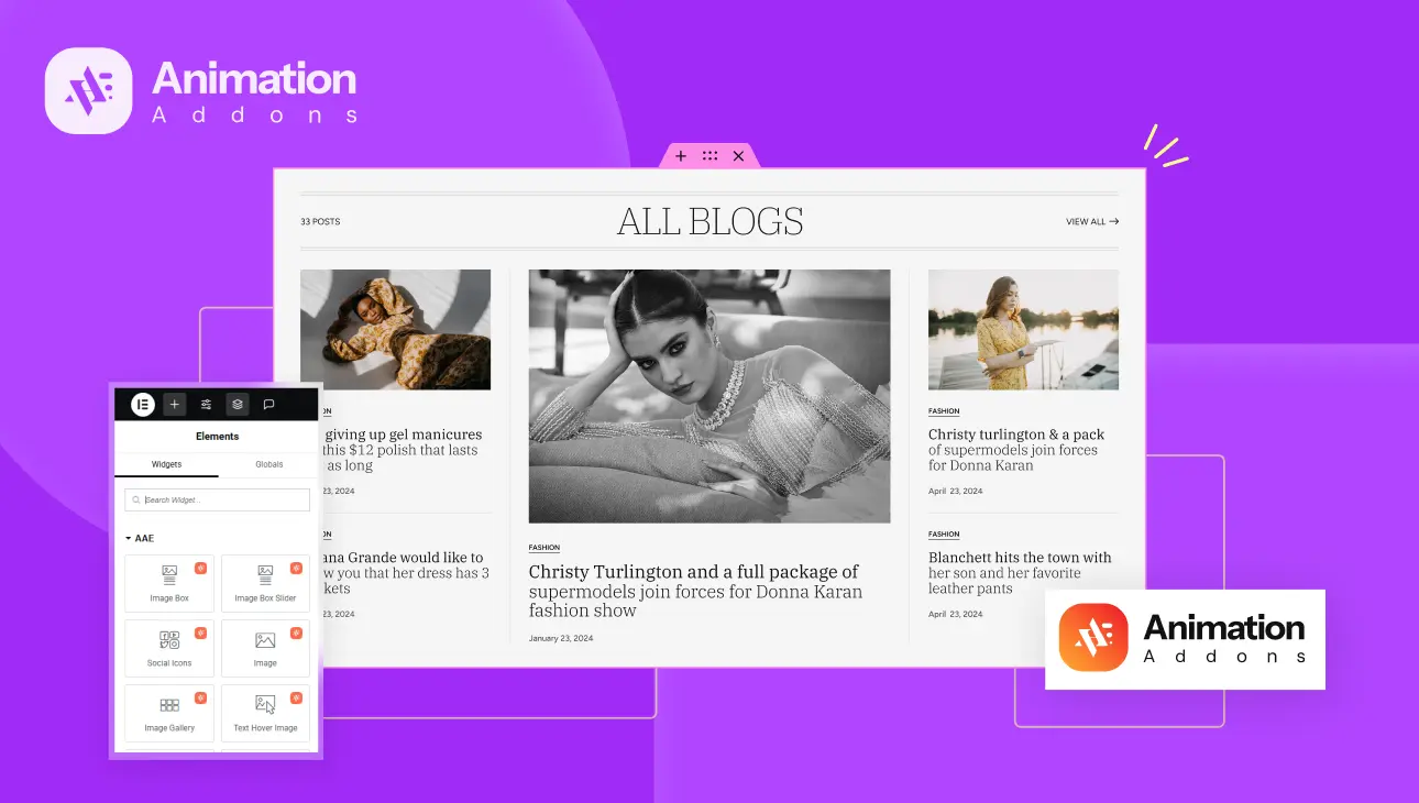
Disable the default page title if your theme displays one. This gives you a clean slate to build your layout. Now, take advantage of Animation Addons’ pre-built Section Templates. These templates are fully customizable sections that come with animations and design elements baked in, giving you a head start. Choose one that closely matches your vision and start editing from there.
Creating the Hero/Intro Section
The hero section sets the tone for your blog. Add a section with a background image or gradient overlay. Use the Animated Title Widget from Animation Addons to display your blog name or tagline. Select an animation type like Text Reveal or 3D Spin to make your headline pop. Customize timing settings such as delay, duration, and stagger, and make use of breakpoints to ensure mobile responsiveness.
Below the headline, add a subtitle or introductory message. Insert a CTA button using the Icon Box Widget with button animation styles like ellipse or underline. This adds both visual interest and a clear next step for the visitor, whether it’s to view your latest post or subscribe.
Featured Blog Posts Section
Add a new section to highlight featured content. If you’re using Elementor Pro, drag in the Posts Widget and filter for “Featured” category tags. Style this section to display in two or three columns, depending on your layout preference.
For enhanced visuals, wrap each post in an Image Box Widget from Animation Addons. This allows you to add hover-based or scroll-triggered animations like fade-in, zoom, or slide-left. You can also add animated icons next to post tags or categories for a more interactive experience.
Recent Posts Grid with Image Gallery Style
For showcasing recent posts in a gallery format, use the Image Gallery Widget. Choose between Grid Layout or Masonry Layout depending on the kind of look you’re after. Grid works well for uniform thumbnails, while masonry adds variety by stacking posts of different sizes.
Enable hover effects such as zoom-in, move-left, or zoom-out. These subtle interactions create a polished, modern feel. You can overlay post titles on hover and trigger animations like text reveal or opacity changes, making each interaction feel deliberate and responsive.
Sidebar with Interactive Widgets
Your sidebar is the place to house auxiliary content. Start with the Accordion Widget for a collapsible category or FAQ menu. This keeps your design clean while offering deep navigation.
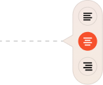
Next, add the Social Icons Widget. With hover animations like Grow, Float, or Rotate, these icons become interactive and fun to use. You can control colors, spacing, and alignment for consistency.
Lastly, insert a Text Hover Image Widget. This works beautifully for author spotlights, promotional banners, or upcoming event teasers. As users hover over the text, the image dynamically changes, creating a memorable interaction that encourages clicks.
Author Bio or Testimonial Section
Create a new section near the bottom of your blog layout for your bio or testimonial. Use the Classic Testimonial Widget from Animation Addons. This widget includes stylized quote icons, image fields, and designation areas to properly introduce yourself or feature testimonials from readers.
Enable scroll-triggered animations such as fade-in or bounce, making the content appear naturally as users reach this part of the page. This adds credibility and a personal touch to your blog, building trust with your audience.
Footer with Call-to-Action and Branding
Your final section should drive action or wrap up your branding. Add the Brand Slider Widget to showcase partner logos, sponsors, or other affiliations. Customize navigation options with arrows or progress bar-style pagination.
Include a final CTA button using unique animation styles like mask, oval, or ellipse from the Animation Addons library. Below that, drop in your social links, a newsletter subscription form, and your copyright.
By keeping the footer clean yet functional, you maintain engagement right until the end.
Optimizing Responsiveness and Performance
Once your layout is complete, shift your focus to optimization. Elementor’s responsive editing panel allows you to toggle between desktop, tablet, and mobile views. Use this to fine-tune spacing, text size, and visibility of widgets on each device.
For animation-heavy sections, be mindful of performance, especially on mobile. Use stagger and delay cautiously so animations don’t overload slower devices. Where appropriate, disable certain animations on mobile altogether using the breakpoint controls provided by Animation Addons.
Compress all images before uploading to reduce page weight. Enable lazy loading for galleries and image widgets to improve load speed. Finally, test your layout across major browsers and devices. What looks great on Chrome might need adjustments on Safari or Firefox. Elementor and its addons make this testing and fine-tuning process smooth and efficient.
Best Practices for Animated Blog Design
Designing with animation requires balance. While it’s tempting to add effects everywhere, restraint leads to elegance. Always prioritize readability. Avoid distracting readers with excessive movement. Animation should serve content, not overshadow it.
Use animation purposefully—to guide the reader’s attention, highlight important sections, or create visual hierarchy. Consistency in animation timing, style, and direction ensures your layout feels cohesive rather than chaotic.
Accessibility is also key. Ensure your animated elements don’t interfere with screen readers or keyboard navigation. Avoid animations that trigger on rapid scroll or mouse hover if they’re essential for content visibility.
Test animations across devices, and use simplified styles on mobile to preserve speed and usability. A well-animated blog should feel intuitive, not flashy for the sake of it.
Conclusion
With the right combination of Elementor, Animation Addons, and custom widgets, building a stunning blog layout in 2025 is not just possible—it’s easy and enjoyable. These tools together create a design ecosystem where creativity meets functionality, and where content is supported by interaction and polish.
We’ve covered the step-by-step process: planning your layout, choosing the right widgets, building out sections with animation, and optimizing your blog for performance and responsiveness. Each widget—whether it’s the Animated Title, Icon Box, or Brand Slider—adds unique value to your design toolkit, helping you create a blog that looks and feels distinctly yours.
In the end, great blog design is about more than visuals. It’s about creating a smooth experience for your readers, telling your story clearly, and encouraging interaction without friction. With Animation Addons and custom widgets, you’re equipped not just to follow trends—but to set them.
So don’t be afraid to experiment. Try different animation styles, layout arrangements, and widget combinations. The tools are in your hands—now it’s time to bring your blog vision to life.


